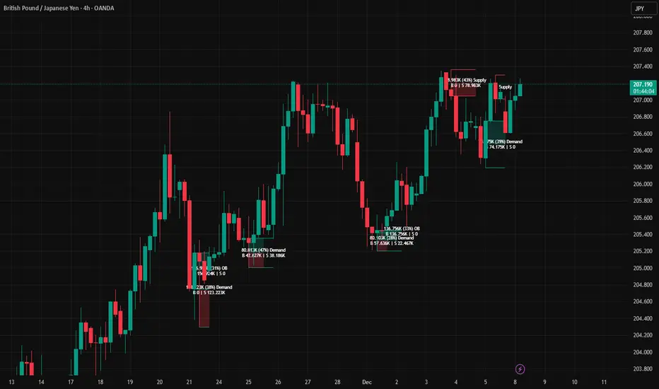
AR–Volumized Blocks & S&DAR–Volumized Blocks & S&D is a clean, price-action order-block tool that automatically detects Bullish & Bearish Order Blocks (OB), tracks their evolving state into Mitigation Blocks (MB) and Breaker Blocks (BB), and adds a volumetric overlay showing an estimated split between buyers vs sellers inside each zone. It also includes a lightweight Supply & Demand (S&D) module with the same buy/sell visualization.
This indicator is designed to keep the chart readable: zones are drawn with thin boundaries, optional breaker fill, short reference lines, centered labels, and shortened volumetric bars (instead of huge full-width blocks).
________________________________________
What it draws
1) Order Blocks with State Tracking
Each detected Order Block is shown with:
• Top/Bottom boundaries (thin lines)
• A zone container (mostly invisible for OB/MB, semi-filled for BB)
• A label that updates live with:
o Total zone volume
o Volumetric balance %
o Current state: OB / MB / BB
o Optional extra line: Buy vs Sell estimate
States
• OB (Order Block): Newly detected zone, still valid.
• MB (Mitigation Block): Zone has been touched by price (mitigated) but not broken.
• BB (Breaker Block): Zone has been invalidated (broken through) and becomes a breaker.
Optional BB cleanup
• “Hide invalidated BB” can auto-remove breaker blocks that become invalid again (to keep the chart clean and only show active breakers).
________________________________________
2) Supply & Demand Zones
Supply & Demand zones are detected using pivot logic:
• Supply: pivot highs → zone from pivot high down to pivot candle body area
• Demand: pivot lows → zone from pivot low up to pivot candle body area
They are drawn as:
• A zone holder + thin lines
• A label (“Supply” / “Demand”), with optional volumetric text
• Optional buy/sell volumetric bars, same style as OB/BB/MB
S&D zones are removed completely once broken (clean and decisive behavior).
________________________________________
Volumetric Buy/Sell (the mini bars + text)
This script adds an extra layer called Volumetric (Buy/Sell):
-Volumetric Bars (short + clean)
Inside each zone, it can draw two small stacked bars:
• Top half: Buy volume (green)
• Bottom half: Sell volume (red)
You can choose:
• Display side (Left or Right of the zone)
• Bar length in bars (shortened by design)
• Transparency
-Volumetric Text (buyers vs sellers)
The label can optionally show:
• B 123K | S 98K
So you instantly see who dominated in that block.
Important Note (Very Honest)
These buy/sell numbers are NOT real bid/ask delta.
They are an estimate based on candle direction:
• If a candle closes green (close ≥ open) → its volume is counted as “buy”
• If it closes red (close < open) → its volume is counted as “sell”
This is still extremely useful for visual confirmation, but it is not a broker-level footprint.
________________________________________
Detection Logic Summary (simple + effective)
Order Block detection (swing-based)
• Uses a swing finder to identify relevant turning points.
• Confirms OB creation on a breakout beyond the swing level.
• Builds the OB range by walking backward to capture the strongest base candle area.
• Filters out oversized zones using ATR × Max OB height filter.
Zone lifetime handling
• Zones extend forward automatically.
• OB becomes MB on first meaningful touch.
• OB becomes BB if violated in the opposite direction.
• BB can optionally be hidden if it becomes invalid (depending on your settings).
________________________________________
Inputs & Customization
Detection
• Swing length (OB): controls sensitivity. Lower = more zones, higher = fewer stronger zones.
• Use candle body for extremes: reduces wick noise by using candle bodies for boundaries.
• ATR filter: avoids huge messy blocks (keeps zones tradable).
• Max zones to keep: keeps chart lightweight.
Visual
• Bull/Bear colors
• Label size
• Forward extension
• Short line length
• Label offset
Supply & Demand
• Enable/disable S&D
• Pivot swing length
• Forward extension, line length
• Label offset X and Y (ticks)
• Max S&D zones
Volumetric Buy/Sell
• Turn bars on/off
• Turn text on/off
• Bars side (left/right)
• Bar length (short, by bars)
• Bar transparency
________________________________________
How to use (practical workflow)
For Entries
• Use Bullish OB / Demand as a potential buy zone after a displacement up.
• Use Bearish OB / Supply as a potential sell zone after a displacement down.
• Look for confluence:
o market structure shift / BOS + displacement candle + return to OB/MB
For Bias Filtering
• The buy/sell split helps you quickly sanity-check:
o A “bullish OB” that shows heavy sell dominance might be weaker (and vice versa)
o Strong imbalance zones often show a clear dominance split
For Risk Management
• BB zones are great “line in the sand” areas.
• Use zone boundaries for invalidation, with your own model rules.
________________________________________
Performance Notes
This script is built with object limits in mind and includes:
• max_boxes_count, max_lines_count, max_labels_count
• Cleanup logic when max zones are exceeded
• Optional hiding of invalid breakers to reduce clutter
________________________________________
Disclaimer
This tool provides technical visualization and estimated volumetric info based on candle direction. It does not represent true order flow, bid/ask delta, or broker tape. Always risk-manage properly and confirm with your trading plan.
Cari dalam skrip untuk "Buy sell"
Trend Gazer: Unified ICT Trading System with Signals# Trend Gazer User Guide (English)
## 📖 Table of Contents
1. (#about-this-indicator)
2. (#quick-start-guide-3-steps)
3. (#detailed-usage)
4. (#settings-customization)
5. (#why-combine-multiple-features)
6. (#faq)
---
## About This Indicator
**Trend Gazer** is an integrated trading system designed to read institutional order flow like professional traders.
### 🎯 3 Problems This Indicator Solves
#### ❌ Problem 1: Too Many Indicators = Information Overload
```
Normal: RSI + MACD + Moving Average + Bollinger Bands... → Cluttered chart
Solution: All integrated into ONE indicator → Clean & Clear
```
#### ❌ Problem 2: Single Indicators Give False Signals
```
Normal: Enter based on RSI alone → Frequent stop-outs
Solution: Structure × Zone × Momentum multi-angle confirmation → Higher win rate
```
#### ❌ Problem 3: Unclear Entry Timing
```
Normal: Know the trend but don't know WHERE to enter
Solution: LS Bounce Signal shows EXACT entry points
```
---
## Quick Start Guide (3 Steps)
### 🚀 STEP 1: Confirm Trend Direction
**Look for CHoCH (Change of Character)**
```
📍 (1.CHoCH) label = Uptrend starting
📍 (a.CHoCH) label = Downtrend starting
```
**Important**: Wait for CHoCH! No direction without it.
---
### 🎯 STEP 2: Find Entry Points
**Wait for LS Bounce Signal (green/red labels)**
```
🟢 "Long@ HL only" label → LONG (buy) candidate
🔴 "Short@ LH only" label → SHORT (sell) candidate
```
**Label text color meaning**:
- **White text**: Clean trend (high confidence)
- **Yellow text**: Trend transition (moderate caution)
---
### 🛡️ STEP 3: Final Confirmation with Bar Color
**Bar color shows market state**
```
🔴 Red bar: BUY zone (buying is favored)
🟢 Green bar: SELL zone (selling is favored)
⚪ White bar: Neutral (wait and see)
```
---
## Detailed Usage
### 📊 Understanding the Chart
#### 1. Labels (Market Structure Changes)
```
(1.CHoCH) / (a.CHoCH) : Trend reversal
(2.SiMS) / (b.SiMS) : Momentum confirmation
(3.BoMS) / (c.BoMS) : Trend continuation
```
#### 2. Boxes (Institutional Order Zones)
```
📦 Blue boxes: Bullish OB (buy orders accumulated)
📦 Red boxes: Bearish OB (sell orders accumulated)
📦 Black transparent boxes: Liquidity Sweep
```
**How to use Order Blocks**:
- Function as support/resistance
- Signals within OB have higher reliability
- Use for stop-loss placement
#### 3. Lines (Trends and Support/Resistance)
```
━━━ Red lines: EMA20, EMA50, EMA100 (short to mid-term trends)
━━━ Blue lines: 60min NPR/BB bands (support/resistance)
```
#### 4. Bar Colors (Filter 6)
```
Bar color = Real-time market state
🔴 Red: Buying is favored
🟢 Green: Selling is favored
⚪ White: Neutral
```
---
### 🎯 Practical Trading Flow
#### 📍 Preparation Phase
```
1. Open chart (recommended: 5min or 15min)
2. Add Trend Gazer to chart
3. Start in observation mode (don't enter yet)
```
#### 📍 Entry Decision
```
✅ CHoCH confirms direction → Uptrend starting
✅ LS Bounce Signal "Long@ HL only" appears
→ Entry point candidate
✅ Bar turns red → Market supports buying
→ Entry decision 🎯
✅ Place stop below nearest Order Block (blue box)
```
#### 📍 Exit Decision
```
🔴 Opposite LS Bounce Signal "Short@ LH only" appears
→ Consider taking profit
🔴 Bar turns green
→ Potential trend reversal, review position
🔴 Stop loss hit
→ Exit with loss
```
---
### 💡 Tips for Higher Win Rate
#### ✅ DO's
```
1. Enter AFTER CHoCH appears
2. Prioritize white-text LS Bounce Signals
3. Check higher timeframe (1H or Daily) trend
4. Emphasize signals within Order Blocks
5. Use bar color as final confirmation
```
#### ❌ DON'Ts
```
1. Enter before CHoCH → No clear direction
2. Enter only on yellow text → Unstable transition period
3. Ignore bar color → Trading against market state
4. Don't check Order Blocks → Unclear support/resistance
5. Enter same direction consecutively → Overtrading
```
---
## Settings Customization
### 🔧 How to Open Settings
```
1. Right-click on indicator name on chart
2. Select "Settings..."
3. Settings panel opens
```
---
### 📋 Recommended Setting Profiles
#### 🔰 Beginner Settings (Simple)
**Goal**: Reduce noise, show only important signals
```
【FILTERS】
✅ Bonus Filter: ON
✅ Filter 6 (OB/BB/NPR Zone Filter): ON
❌ Direction Filter: OFF
❌ Liquidation Reversal Filter: OFF
❌ ICT Market Structure Filter: OFF
❌ EMA Trend Filter: OFF
❌ OB/FVG Filter 1: OFF
❌ OB/FVG Filter 2: OFF
【SIGNALS】
✅ Signal 0 (Bonus): ON
✅ Signal 1 (VWC Change): ON
✅ Signal 2 (Liq Rev): ON
❌ Signal 3 (LS): OFF (complex alone)
❌ Signal 4 (LS Break): OFF
❌ Signal 5 (OB+LS NPR): OFF
❌ Signal 6 (OB+LS EMA): OFF
【LS BOUNCE SIGNAL】
✅ Exclude EMA50 from touch detection: OFF
❌ Only show when EMA fills are mixed: OFF
```
**What happens with this setup**:
- Only Bonus (black background) signals display
- LS Bounce Signals clearly visible
- Noisy signals filtered out
---
#### 💪 Intermediate Settings (Balanced)
**Goal**: Enable key filters for better accuracy
```
【FILTERS】
✅ Bonus Filter: ON
✅ Filter 6 (OB/BB/NPR Zone Filter): ON
✅ ICT Market Structure Filter: ON
❌ Direction Filter: OFF
❌ Liquidation Reversal Filter: OFF
❌ EMA Trend Filter: OFF
❌ OB/FVG Filter 1: OFF
❌ OB/FVG Filter 2: OFF
【SIGNALS】
✅ Signal 0 (Bonus): ON
✅ Signal 1 (VWC Change): ON
✅ Signal 2 (Liq Rev): ON
✅ Signal 3 (LS): ON
❌ Signal 4 (LS Break): OFF
❌ Signal 5 (OB+LS NPR): OFF
❌ Signal 6 (OB+LS EMA): OFF
【LS BOUNCE SIGNAL】
✅ Exclude EMA50 from touch detection: OFF
❌ Only show when EMA fills are mixed: OFF
```
**What happens with this setup**:
- Signals only after CHoCH (trend confirmed)
- Filter 6 changes bar colors
- Liquidity Sweeps also displayed
---
#### 🚀 Advanced Settings (Full Utilization)
**Goal**: Master all features
```
【FILTERS】
✅ Bonus Filter: ON
✅ Filter 6 (OB/BB/NPR Zone Filter): ON
✅ ICT Market Structure Filter: ON
✅ Direction Filter: ON
✅ EMA Trend Filter: ON
❌ Liquidation Reversal Filter: OFF (optional)
✅ OB/FVG Filter 1: ON
✅ OB/FVG Filter 2: ON
【SIGNALS】
✅ All ON
【LS BOUNCE SIGNAL】
✅ Exclude EMA50 from touch detection: ON (reduce EMA50 noise)
✅ Only show when EMA fills are mixed: ON (show only transition zones)
```
**What happens with this setup**:
- Fewer signals (precision-focused)
- Multiple confirmations greatly reduce false signals
- Only signals confirmed by trend, momentum, and zones
---
### 🎨 Display Customization
#### Change Label Size
```
【BUY/SELL SIGNAL APPEARANCE】
→ "BUY/SELL Label Size"
→ Choose from: tiny / small / normal / large / huge
Recommended: small (default)
```
#### Order Block Display Settings
```
【ORDER BLOCK (OB) SETTINGS】
✅ Show Current TF OB: Current timeframe OB
✅ Show 1min OB: 1-minute OB
✅ Show 5min OB: 5-minute OB
✅ Show 15min OB: 15-minute OB
Recommended: Only 15min OB ON (simple)
```
#### Liquidity Sweep Display
```
【LIQUIDITY SWEEPS SETTINGS】
→ "Sweep Length": Sensitivity (small=frequent, large=selective)
→ "Sweep Option": Standard / Maximum
Recommended: Length=40, Option=Standard
```
#### NPR/BB Bands Display
```
【NPR (NON-REPAINT STDEV) SETTINGS】
✅ Display 60min NPR Bands: 60-minute support/resistance
❌ Display Current TF NPR Bands: Current timeframe (optional)
Recommended: Only 60min ON
```
---
### ⚙️ Advanced Settings
#### Fine-tune Filter 6
```
【FINAL FILTERS】
→ "Enable Filter 6 (OB/BB/NPR Zone Filter)"
When ON:
- Bars color-coded red/green/white
- Behavior at OB, NPR/BB touches controlled
```
#### LS Bounce Signal Adjustments
```
【LS BOUNCE SIGNAL】
→ "Exclude EMA50 from touch detection"
OFF: Detect NPR/BB/EMA50 (all 3)
ON: Detect NPR/BB only (exclude EMA50)
→ "Only show when EMA fills are mixed"
OFF: Show all LS Bounce Signals
ON: Show only transition zone signals (yellow text)
```
#### MTF (Multi-Timeframe) Control
```
【ORDER BLOCK (OB) SETTINGS】
→ "Disable MTF on 1hr+ Charts"
ON: Disable MTF on 1H+ (save memory)
OFF: MTF enabled on all timeframes
Recommended: ON (unnecessary on larger timeframes)
```
---
### 🎯 Purpose-Based Configuration Guide
#### 🔍 Goal 1: Reduce Signal Count
```
✅ Bonus Filter: ON
✅ ICT Market Structure Filter: ON
✅ Filter 6: ON
✅ All Signals OFF, only Signal 0 ON
```
#### 🔍 Goal 2: Get More Signals
```
❌ All Filters OFF
✅ All Signals ON
```
#### 🔍 Goal 3: Trend Following Only
```
✅ ICT Market Structure Filter: ON
✅ Direction Filter: ON
✅ EMA Trend Filter: ON
```
#### 🔍 Goal 4: Counter-Trend Trading
```
✅ LS Bounce Signal: ON
✅ Filter 6: ON
❌ ICT Market Structure Filter: OFF
```
#### 🔍 Goal 5: Day Trading (5-15min charts)
```
✅ Show 15min OB: ON
✅ Display 60min NPR Bands: ON
✅ LS Bounce Signal: ON
❌ Show 1min/5min OB: OFF
```
#### 🔍 Goal 6: Scalping (1-5min charts)
```
✅ Show 5min OB: ON
✅ Show 15min OB: ON
✅ Display 60min NPR Bands: ON
✅ All Signals: ON
```
---
### 💾 Saving and Loading Settings
#### Save Settings
```
1. Click "..." in top-right of Settings screen
2. Select "Save as default"
→ Same settings auto-applied next time
```
#### Reset Settings
```
1. Click "..." in top-right of Settings screen
2. Select "Reset settings"
→ Return to default settings
```
---
## Why Combine Multiple Features?
### 🎯 Problem: Single Indicator Limitations
Common trader problems:
```
❌ RSI alone → Trade against trend, lose
❌ Moving Average alone → Late entry timing
❌ Support/Resistance alone → Caught by false breakouts
```
**Markets are complex**. One angle isn't enough.
---
### 💡 Solution: Multi-Angle Integrated Approach
#### 1️⃣ Structure × Zone × Momentum
```
📐 Structure (ICT CHoCH)
→ "Which direction is likely?"
📦 Zone (OB/NPR/BB)
→ "Where will price react?"
💨 Momentum (EMA/VWC)
→ "Is there momentum now?"
```
**When all 3 align = Highest win-rate timing**
---
#### 2️⃣ Multi-Timeframe Analysis
```
Big picture: Confirm Daily direction
Medium-term: Check 1H Order Blocks
Short-term: Time entry on 5min
```
**Short-term entries aligned with higher timeframes = Better win rate**
---
#### 3️⃣ Understanding Liquidity
```
🎣 Institutional strategy:
1. Intentionally move price opposite to stop out retail
2. Then, move in real direction
💡 Liquidity Sweep = Visualize this "trap"
→ Read institutional order flow
```
---
### 🧠 Integration Examples
#### Case 1: RSI Alone vs Integrated System
**Scenario**: RSI at 30 (oversold)
```
❌ RSI-only decision:
→ "Buy!"
→ But downtrend continues, loss 😢
✅ Trend Gazer:
CHoCH check → Still downtrend ❌
Order Block → In Bearish OB ❌
LS Bounce → SHORT signal only ❌
→ Skip or SHORT
→ Avoid loss ✅
```
**Result**: Multiple filters block wrong entry
---
#### Case 2: LS Bounce Signal 2-Stage Logic
**Scenario**: Price touches 60min NPR lower band
```
🔍 Traditional method:
Touched → Buy!
→ But price continues down 😢
✅ Trend Gazer:
Stage 1: NPR touch + red bar → Flag ON
Stage 2: EMA20 crosses above EMA50 → Confirm bounce
→ Now "Long@ HL only" displays
→ Entry → Success ✅
```
**Result**: Not just "touch" but "touch + bounce confirmation" improves accuracy
---
### 🎓 Progressive Learning Design
This indicator is designed for **beginners to advanced**:
```
📖 Beginner (Month 1):
Use only CHoCH + LS Bounce Signal
→ Learn trend and entry points
📖 Intermediate (Months 2-3):
Add Order Block + Bar Color
→ Learn support/resistance and filtering
📖 Advanced (Month 6+):
Master all features
→ Read institutional order flow
```
**Ultimate goal**: Indicator becomes confirmation tool. Your market sense becomes primary.
---
### 🔬 Technical Advantages
#### 1. Non-Repaint STDEV (NPR)
```
Normal Bollinger Bands:
→ Past data changes (repaints)
→ Inaccurate backtesting
NPR:
→ Past data doesn't change (non-repaint)
→ Reliable verification possible
```
#### 2. 2-Stage Signal Logic
```
Traditional: Condition met → Immediate signal
→ Many false signals
Trend Gazer: Condition1 → Flag ON → Condition2 → Signal
→ Confirmation step improves accuracy
```
#### 3. Alternating Filter
```
Problem: Same-direction signals spam
→ Overtrading
Solution: LONG → SHORT → LONG alternating only
→ Prevent unnecessary entries
```
---
### 💎 Conclusion: Why Integration?
```
Single indicator = "Partial truth"
Integrated system = "3D market perspective"
```
**Markets are multifaceted**. One angle isn't enough.
Trend Gazer **integrates multiple screens pros watch simultaneously into ONE**,
allowing beginners to read charts with institutional perspective.
---
## FAQ
### ❓ Q1: Which timeframe is best?
**A**: Depends on trading style
```
Scalping: 1min ~ 5min
Day Trading: 5min ~ 15min
Swing: 1H ~ 4H
```
**Important**: LS Bounce Signal only works on 30min and below.
---
### ❓ Q2: Too many signals, confused
**A**: Enable filters
```
【Recommended Settings】
✅ Bonus Filter: ON
✅ Filter 6: ON
✅ ICT Market Structure Filter: ON
→ Show only Signal 0
```
This significantly reduces signal count.
---
### ❓ Q3: No CHoCH appearing, what to do?
**A**: Wait or check higher timeframe
```
Method 1: Wait for CHoCH (recommended)
Method 2: Check higher timeframe (e.g., Daily) for trend
Method 3: Disable ICT Filter (not recommended)
```
**When trend is unclear, sitting out is also strategy**.
---
### ❓ Q4: LS Bounce Signal not appearing
**A**: Checkpoints
```
1. Are you on 30min or below chart?
→ Doesn't show on 1H+
2. Are NPR/BB bands displayed?
→ Check Settings "Display 60min NPR Bands"
3. Is EMA50 excluded?
→ If "Exclude EMA50" is ON, EMA50 signals won't show
```
---
### ❓ Q5: Bar color not changing?
**A**: Check Filter 6
```
Settings → FINAL FILTERS
→ Confirm "Enable Filter 6 (OB/BB/NPR Zone Filter)" is ON
If ON but still not changing:
→ Current price may be outside OB/NPR/BB zones
```
---
### ❓ Q6: Too many Order Blocks, hard to see
**A**: Narrow down displayed OBs
```
Settings → ORDER BLOCK (OB) SETTINGS
Recommended:
❌ Show Current TF OB: OFF
❌ Show 1min OB: OFF
❌ Show 5min OB: OFF
✅ Show 15min OB: ON (only this)
```
---
### ❓ Q7: How to improve win rate?
**A**: Thorough multiple confirmations
```
Checklist:
✅ CHoCH appeared
✅ LS Bounce Signal (white text)
✅ Bar color matches (red bar=LONG, green bar=SHORT)
✅ Signal within Order Block
✅ Aligns with higher timeframe trend
Enter ONLY when all align
```
---
### ❓ Q8: Want to practice on demo
**A**: Recommended practice method
```
Week 1: Observation only
→ Watch signals and chart movement
→ Resist entering
Weeks 2-3: Keep records
→ Screenshot when signal appears
→ Record subsequent movement
Week 4+: Start demo trading
→ Start with small amounts
→ Continue keeping records
```
---
### ❓ Q9: Are there alert features?
**A**: Yes, multiple alerts available
```
Setup method:
1. Right-click indicator on chart
2. Select "Add Alert..."
3. Choose from:
- ANY ALERT: BUY/SELL Signals
- BUY ONLY ALERT
- SELL ONLY ALERT
- MS UP / MS DOWN
- BAR COLOR: RED / LIME
- LS BOUNCE: LONG / SHORT Signal
```
---
### ❓ Q10: Works on other markets?
**A**: Yes, works on all markets
```
✅ Cryptocurrency (BTC, ETH, etc.)
✅ Forex (EUR/USD, USD/JPY, etc.)
✅ Stocks (individual stocks, indices)
✅ Futures (oil, gold, etc.)
```
Works on any market with price and volume data.
---
## 📋 Disclaimer
### ⚠️ Important Notice
This indicator is for **educational and informational purposes only**.
```
❌ NOT investment advice
❌ Does NOT guarantee profits
❌ Past results do NOT guarantee future performance
```
### Risk Warning
```
⚠️ Trading involves substantial risk
⚠️ Only trade with funds you can afford to lose
⚠️ Practice extensively on demo account before live trading
⚠️ Make your own informed decisions and act at your own risk
```
---
## 📞 Support
### Feedback & Questions
Feel free to ask questions in TradingView comments section.
### Bug Reports
Please report with specific details (timeframe, symbol, screenshots).
---
**Author**: rasukaru666
**License**: Mozilla Public License 2.0
**Last Updated**: December 2025
**Version**: Latest
---
**Thank you for using Trend Gazer!**
**Happy Trading! 📈**
---------------

Buy & Sell Arrows - MACD + Best_Solve WPRMACD + Best_Solve Williams %R – Aggressive Trend-Reversal Catcher
(Allow Signals Even in Overbought/Oversold Zones)
This indicator combines the classic MACD histogram with Best_Solve’s popular custom Williams %R (a 0–100 momentum oscillator that behaves more like a fast Stochastic) to deliver clean, high-conviction entry signals on daily (and higher) timeframes.
Core Logic – Only TWO conditions are required
BUY (large green arrow below bar)
MACD histogram is green (bullish momentum)
Williams %R fast line is crossing above OR already above its EMA
SELL (large red arrow above bar)
MACD histogram is red (bearish momentum)
Williams %R fast line is crossing below OR already below its EMA
Unlike most oscillators, this version deliberately removes the traditional “do not buy when overbought / do not sell when oversold” filters. This allows the script to catch powerful trend reversals and explosive moves immediately — even on violent earnings gaps or panic sell-offs (example: META’s -11 % drop on Oct 30 2025 triggered an instant sell even though %R was deeply oversold).
Built-in Clean-Signal Logic
No consecutive buys or sells — each new signal must be preceded by the opposite direction.
This keeps the chart extremely clean and prevents whipsaw clusters during strong trends.
Best Use Cases
Daily and 4H swing trading on stocks, indices, crypto, forex
Excellent for catching sharp reversals after earnings, news events, or overextended moves
Works especially well on high-beta names and growth stocks
Visuals
Large green/red arrows with “BUY” / “SELL” text (your favorite style)
Subtle transparent MACD histogram overlaid on price for instant momentum context
Ready-to-use alerts (“Buy Alert” / “Sell Alert”)
Set it, alert it, trade it — one of the cleanest and most responsive daily reversal systems you’ll find.
Enjoy the edge!

Volume Intelligence LITE [Abusuhil]📊 Volume Intelligence LITE - Professional Scalping Tool
🎯 English Description
Professional Volume Analysis Indicator for Smart Traders
Volume Intelligence LITE is a comprehensive, real-time volume analysis tool designed specifically for scalpers and day traders who need instant volume insights. This professional-grade indicator combines multiple volume metrics, pressure analysis, and intelligent signal generation in a clean, fully customizable interface.
✨ Key Features
📊 Advanced Volume Analysis
Real-time volume monitoring with moving average comparison
Dynamic volume ratio calculation (Current vs Average)
Instant percentage change tracking
Multi-level spike detection system (Weak, Medium, Strong, Extreme)
Customizable spike thresholds for different market conditions
💹 Buy/Sell Pressure System
Real-time buy vs sell pressure percentage calculation
Market dominance indicator (Buyers/Sellers/Neutral)
Weighted Delta analysis for precise pressure measurement
Multi-timeframe pressure lookback (up to 20 bars)
Historical pressure pattern recognition
📈 Integrated Technical Indicators
VWMA (Volume Weighted Moving Average) - Identifies price position relative to volume-weighted levels
OBV (On Balance Volume) - Trend detection with built-in divergence alerts (Bullish/Bearish)
MFI (Money Flow Index) - Smart money flow direction and strength analysis
🤖 Intelligence & Scoring System
Entry Power Score - Combines volume ratio with price movement magnitude
Trend & Volume Alignment - Identifies strong trending markets with volume support
Comprehensive Volume Score - Multi-factor analysis incorporating all metrics
Confidence Level - Percentage-based signal strength indicator (0-100%)
Final Signal - Clear Bullish/Bearish/Neutral market assessment
🎨 Full Customization Options
Bilingual Interface - Complete English & Arabic support
Modular Display - Show/Hide any section independently (8 sections)
Flexible Positioning - 9 table position options (corners, sides, center)
Size Control - Three size options (Tiny, Small, Normal)
Color Themes - Customizable background and text colors
No Chart Clutter - Clean overlay design without background interference
🔧 Detailed Settings
Volume Configuration
Volume MA Length: 5-50 bars (default: 20)
Weak Spike Threshold: 1.5x average
Medium Spike Threshold: 2.0x average
Strong Spike Threshold: 2.5x average
Extreme Spike Threshold: 3.0x average
Technical Indicators
VWMA Length: 5-100 bars (default: 20)
OBV Smoothing: 5-50 bars (default: 14)
MFI Length: 5-50 bars (default: 14)
Pressure Analysis
Lookback Period: 5-20 bars (default: 10)
Automatic pressure calculation for last N bars
Display Controls
Show/Hide Volume Section
Show/Hide Spike Detection Section
Show/Hide Pressure Analysis Section
Show/Hide VWMA Section
Show/Hide OBV Section
Show/Hide MFI Section
Show/Hide Intelligence Section
Show/Hide Final Signal
📱 Ideal For
✅ Scalpers - Quick volume confirmations for rapid trading decisions
✅ Day Traders - Intraday volume pattern analysis and trend confirmation
✅ Swing Traders - Volume-based entry/exit point identification
✅ Smart Money Followers - Institutional volume detection and tracking
✅ Breakout Traders - Volume spike confirmation for breakout validation
✅ All Timeframes - Works on 1m to Daily charts
🚀 How to Use
Setup
Add indicator to your chart
Select your preferred language (English/Arabic)
Customize table position and size
Toggle sections based on your trading style
Adjust volume thresholds for your market
Trading Workflow
Monitor Volume Ratio - Look for spikes above 1.5x
Check Pressure - Confirm buy/sell dominance
Verify Technical Alignment - VWMA, OBV, MFI confirmation
Review Intelligence Score - Volume Score and Confidence Level
Execute on Final Signal - 🟢 Bullish or 🔴 Bearish confirmation
📊 Signal Interpretation Guide
Volume Score System
+30 to +100 🟢 Strong Bullish Volume (High buy pressure, strong uptrend)
-30 to +30 ⚪ Neutral Zone (Wait for confirmation, range-bound)
-100 to -30 🔴 Strong Bearish Volume (High sell pressure, strong downtrend)
Confidence Levels
60%+ 🔥 High Confidence (Strong signal, optimal entry conditions)
30-60% ⚡ Medium Confidence (Moderate signal, use additional confirmation)
Below 30% ⚪ Low Confidence (Weak signal, wait for better setup)
Spike Detection
🔥 Extreme Spike (3.0x+) - Major institutional activity, potential reversal
💪 Strong Spike (2.5-3.0x) - Significant volume, trend acceleration
⚡ Medium Spike (2.0-2.5x) - Above average activity, watch closely
⚠ Weak Spike (1.5-2.0x) - Mild increase, early signal
💡 Trading Tips & Best Practices
For Best Results:
Use on liquid markets (major forex pairs, popular stocks, top cryptocurrencies)
Combine with price action analysis for maximum accuracy
Higher confidence levels (>60%) indicate stronger, more reliable signals
Watch for pressure shifts from sellers to buyers (or vice versa) for reversal signals
Extreme volume spikes often precede major price movements
OBV divergences are powerful reversal indicators
Risk Management:
Never rely on volume alone - always use proper stop losses
Higher confidence doesn't mean guaranteed profit
Volume analysis works best in trending markets
Adjust thresholds based on asset volatility
🌐 Language Support
Full Bilingual Interface
Complete English interface
كامل باللغة العربية (Complete Arabic interface)
Easy toggle in settings
All labels, metrics, and signals translated
⚠️ Important Disclaimer
This indicator is provided for educational and informational purposes only. It is not financial advice. Trading involves substantial risk of loss. Always:
Practice proper risk management
Never risk more than you can afford to lose
Test on demo accounts before live trading
Understand that past performance doesn't guarantee future results
🔄 Updates & Support
Regular updates and improvements. For questions, suggestions, or support, please comment below!
🎯 الوصف بالعربية
مؤشر تحليل الفوليوم الاحترافي للمتداولين الأذكياء
مؤشر Volume Intelligence LITE هو أداة شاملة لتحليل الفوليوم في الوقت الفعلي، مصمم خصيصاً للمضاربين والمتداولين اليوميين الذين يحتاجون إلى رؤى فورية للفوليوم. هذا المؤشر الاحترافي يجمع بين مقاييس الفوليوم المتعددة، تحليل الضغط، وتوليد الإشارات الذكية في واجهة نظيفة وقابلة للتخصيص بالكامل.
✨ المميزات الرئيسية
📊 تحليل متقدم للفوليوم
مراقبة الفوليوم في الوقت الفعلي مع مقارنة المتوسط المتحرك
حساب نسبة الفوليوم الديناميكية (الحالي مقابل المتوسط)
تتبع النسبة المئوية للتغيير الفوري
نظام كشف الانفجارات متعدد المستويات (ضعيف، متوسط، قوي، شديد)
عتبات انفجار قابلة للتخصيص لظروف السوق المختلفة
💹 نظام ضغط الشراء والبيع
حساب نسبة ضغط الشراء مقابل البيع في الوقت الفعلي
مؤشر سيطرة السوق (المشترون/البائعون/محايد)
تحليل الدلتا المرجح لقياس الضغط الدقيق
مراجعة ضغط متعدد الأطر الزمنية (حتى 20 شمعة)
التعرف على أنماط الضغط التاريخية
📈 مؤشرات تقنية متكاملة
VWMA (المتوسط المتحرك المرجح بالحجم) - يحدد موقع السعر بالنسبة للمستويات المرجحة بالحجم
OBV (حجم التوازن) - كشف الاتجاه مع تنبيهات التباعد المدمجة (صعودي/هبوطي)
MFI (مؤشر تدفق الأموال) - تحليل اتجاه وقوة تدفق الأموال الذكية
🤖 نظام الذكاء والتقييم
درجة قوة الدخول - يجمع بين نسبة الفوليوم وحجم حركة السعر
توافق الاتجاه والفوليوم - يحدد الأسواق ذات الاتجاه القوي مع دعم الفوليوم
درجة الفوليوم الشاملة - تحليل متعدد العوامل يتضمن جميع المقاييس
مستوى الثقة - مؤشر قوة الإشارة بالنسبة المئوية (0-100٪)
الإشارة النهائية - تقييم واضح للسوق (صعودي/هبوطي/محايد)
🎨 خيارات تخصيص كاملة
واجهة ثنائية اللغة - دعم كامل للإنجليزية والعربية
عرض معياري - إظهار/إخفاء أي قسم بشكل مستقل (8 أقسام)
موضع مرن - 9 خيارات لموقع الجدول (الزوايا، الجوانب، الوسط)
التحكم في الحجم - ثلاثة خيارات للحجم (صغير جداً، صغير، عادي)
سمات الألوان - خلفية ونصوص قابلة للتخصيص
لا فوضى في الرسم البياني - تصميم نظيف بدون تداخل في الخلفية
🔧 إعدادات تفصيلية
تكوين الفوليوم
طول المتوسط المتحرك للفوليوم: 5-50 شمعة (افتراضي: 20)
عتبة الانفجار الضعيف: 1.5 ضعف المتوسط
عتبة الانفجار المتوسط: 2.0 ضعف المتوسط
عتبة الانفجار القوي: 2.5 ضعف المتوسط
عتبة الانفجار الشديد: 3.0 ضعف المتوسط
المؤشرات التقنية
طول VWMA: 5-100 شمعة (افتراضي: 20)
تنعيم OBV: 5-50 شمعة (افتراضي: 14)
طول MFI: 5-50 شمعة (افتراضي: 14)
تحليل الضغط
فترة المراجعة: 5-20 شمعة (افتراضي: 10)
حساب تلقائي للضغط لآخر N شمعة
عناصر التحكم في العرض
إظهار/إخفاء قسم الفوليوم
إظهار/إخفاء قسم كشف الانفجار
إظهار/إخفاء قسم تحليل الضغط
إظهار/إخفاء قسم VWMA
إظهار/إخفاء قسم OBV
إظهار/إخفاء قسم MFI
إظهار/إخفاء قسم الذكاء
إظهار/إخفاء الإشارة النهائية
📱 مثالي لـ
✅ المضاربون - تأكيدات فوليوم سريعة لقرارات التداول السريع
✅ المتداولون اليوميون - تحليل أنماط الفوليوم اليومية وتأكيد الاتجاه
✅ المتداولون المتأرجحون - تحديد نقاط الدخول/الخروج المبنية على الفوليوم
✅ متتبعو الأموال الذكية - كشف وتتبع الفوليوم المؤسسي
✅ متداولو الاختراق - تأكيد انفجارات الفوليوم للتحقق من الاختراق
✅ جميع الأطر الزمنية - يعمل من 1 دقيقة إلى الرسوم البيانية اليومية
🚀 كيفية الاستخدام
الإعداد
أضف المؤشر إلى الرسم البياني الخاص بك
اختر لغتك المفضلة (إنجليزي/عربي)
خصص موقع وحجم الجدول
قم بتبديل الأقسام بناءً على أسلوب التداول الخاص بك
اضبط عتبات الفوليوم لسوقك
سير عمل التداول
راقب نسبة الفوليوم - ابحث عن الانفجارات فوق 1.5 ضعف
تحقق من الضغط - أكد سيطرة الشراء/البيع
تحقق من التوافق التقني - تأكيد VWMA، OBV، MFI
راجع درجة الذكاء - درجة الفوليوم ومستوى الثقة
نفذ على الإشارة النهائية - تأكيد 🟢 صعودي أو 🔴 هبوطي
📊 دليل تفسير الإشارات
نظام درجة الفوليوم
+30 إلى +100 🟢 فوليوم صعودي قوي (ضغط شراء عالي، اتجاه صاعد قوي)
-30 إلى +30 ⚪ منطقة محايدة (انتظر التأكيد، محدود النطاق)
-100 إلى -30 🔴 فوليوم هبوطي قوي (ضغط بيع عالي، اتجاه هابط قوي)
مستويات الثقة
60٪+ 🔥 ثقة عالية (إشارة قوية، ظروف دخول مثالية)
30-60٪ ⚡ ثقة متوسطة (إشارة معتدلة، استخدم تأكيداً إضافياً)
أقل من 30٪ ⚪ ثقة منخفضة (إشارة ضعيفة، انتظر إعداداً أفضل)
كشف الانفجار
🔥 انفجار شديد (3.0 ضعف +) - نشاط مؤسسي كبير، انعكاس محتمل
💪 انفجار قوي (2.5-3.0 ضعف) - فوليوم كبير، تسارع الاتجاه
⚡ انفجار متوسط (2.0-2.5 ضعف) - نشاط فوق المتوسط، راقب عن كثب
⚠ انفجار ضعيف (1.5-2.0 ضعف) - زيادة خفيفة، إشارة مبكرة
💡 نصائح التداول وأفضل الممارسات
للحصول على أفضل النتائج:
استخدمه في الأسواق السائلة (أزواج الفوركس الرئيسية، الأسهم الشعبية، العملات المشفرة الأعلى)
ادمجه مع تحليل حركة السعر لأقصى دقة
مستويات الثقة الأعلى (> 60٪) تشير إلى إشارات أقوى وأكثر موثوقية
راقب تحولات الضغط من البائعين إلى المشترين (أو العكس) لإشارات الانعكاس
انفجارات الفوليوم الشديدة غالباً ما تسبق حركات السعر الكبيرة
تباعدات OBV هي مؤشرات انعكاس قوية
إدارة المخاطر:
لا تعتمد على الفوليوم وحده أبداً - استخدم دائماً وقف الخسائر المناسبة
الثقة الأعلى لا تعني ربحاً مضموناً
تحليل الفوليوم يعمل بشكل أفضل في الأسواق ذات الاتجاه
اضبط العتبات بناءً على تقلب الأصل
🌐 دعم اللغات
واجهة ثنائية اللغة كاملة
واجهة إنجليزية كاملة
واجهة عربية كاملة
تبديل سهل في الإعدادات
جميع التسميات والمقاييس والإشارات مترجمة
⚠️ إخلاء مسؤولية هام
يتم توفير هذا المؤشر لأغراض تعليمية وإعلامية فقط. إنه ليس نصيحة مالية. ينطوي التداول على مخاطر كبيرة للخسارة. دائماً:
مارس إدارة المخاطر المناسبة
لا تخاطر بأكثر مما يمكنك تحمل خسارته
اختبر على حسابات تجريبية قبل التداول المباشر
افهم أن الأداء السابق لا يضمن النتائج المستقبلية
🔄 التحديثات والدعم
تحديثات وتحسينات منتظمة. للأسئلة أو الاقتراحات أو الدعم، يرجى التعليق أدناه!
Developed by Abusuhil | تطوير عبدالرحمن أبوسهيل
Tags: #Volume #Scalping #DayTrading #VolumeAnalysis #OrderFlow #SmartMoney #TradingIndicator #PineScript #الفوليوم #المضاربة #التداول_اليومي #تحليل_الفوليوم

HTF/CTF High/Low Mitigation with SignalsHTF/CTF High/Low Mitigation with Signals Indicator
Overview
HTF/CTF High/Low Mitigation with Signals (shortened as "H/L Signals+") is an advanced overlay indicator for TradingView, designed to identify and visualize higher timeframe (HTF) and current timeframe (CTF) swing highs/lows, track their mitigation, and generate filtered buy/sell signals using an EMA ribbon trend filter. It incorporates automated trade simulation with risk/reward (RR) visualization, position sizing based on user-defined risk, and a statistics table for performance evaluation. This tool is ideal for multi-timeframe traders focusing on swing trading, breakout strategies, or trend reversals across assets like forex, futures, metals (e.g., XAU/USD, XAG/USD), stocks, or cryptocurrencies.
The "meshup" (mashup) integrates several complementary elements: Multi-timeframe swing level detection (HTF for broader structure, CTF for finer details) with mitigation logic ensures signals align with market structure breaks; an EMA ribbon provides a dynamic trend bias to filter counter-trend trades; risk management automates position sizing and RR calculations for disciplined trading; and built-in backtesting stats offer quick insights into hypothetical performance. This combination reduces noise from isolated indicators—e.g., raw swings can be choppy, EMAs alone lag structure, and manual RR is error-prone—creating a cohesive system for spotting high-probability setups where structure, trend, and risk align. By meshing these, it aims to enhance decision-making in trending or ranging markets, though it's reactive and best used with confirmation. Note: This is a technical tool for educational purposes only; it does not provide financial advice, guarantees of profitability, or trading recommendations. Past performance is not indicative of future results, and users should backtest thoroughly on their specific assets/timeframes, in compliance with TradingView's house rules.
Key Features
• HTF Swing Levels: Detects and draws session highs/lows from a user-selected higher timeframe (e.g., Daily), extends lines until mitigated (by wick or body close), with alerts on mitigation.
• CTF Swing Levels: Identifies local swing highs/lows on the chart timeframe using a pivot candle formation (default 5-candle), with separate limits for unmitigated/mitigated lines.
• EMA Ribbon: A three-EMA system (fast 8, mid 13, slow 21) with gradient fills (green for bullish, red for bearish) to visualize trend strength and filter signals.
• Signal Generation: Buy/sell labels ("BUY"/"SELL") triggered post-mitigation when price aligns with EMA trend (e.g., above slow EMA with stacked bulls for buys).
• Trade Simulation & Risk Management: On signals, calculates stop-loss (SL) from recent extremes, position size based on fixed risk amount (e.g., $100 per trade, adjusted for asset type like futures point value or forex lots), and full take-profit (TP) at user-defined RR level (1-5). Draws RR boxes for visuals.
• Statistics Table: Displays total trades, wins/losses, win rate (%), net R-return, and max consecutive losses in a top-right table.
• Alerts: Customizable alerts for HTF mitigations and new trades (including entry, SL, TP, size).
• Visual Customizations: Toggle lines/ribbon/boxes, adjust colors/styles/widths for unmitigated/mitigated lines (HTF/CTF), min box width.
• Performance Optimization: Automatically cleans up excess lines to stay within max limits (e.g., 15 unmitigated HTF, 5 CTF).
How It Works
• HTF Logic: On new HTF bars (via time(htf_timeframe)), captures session high/low and draws extendable lines. Lines extend rightward until mitigated (high/close > high level for highs, low/close < low level for lows, toggle wick/body). Mitigation sets "waiting" flags for signals and triggers alerts.
• CTF Logic: Scans for pivot highs/lows using a user-defined candle count (e.g., 2 left/right for 5-candle swings). Draws and extends lines similarly, mitigating on wick touches, with separate styles for mitigated (e.g., dotted gray).
• EMA Ribbon Logic: Computes 8/13/21 EMAs; fills mid-slow and fast-mid with bullish green (close > slow EMA) or bearish red gradients.
• Signal Conditions: Post-mitigation (waiting_for_buy/sell true), checks EMA stack—buys require close > slow, fast > mid > slow; sells require close < slow, fast < mid < slow. Signals only on confirmed bars.
• Trade Execution: On signal, sets entry at close, scans back to mitigation bar for tightest SL (lowest low for buys, highest high for sells). Calculates risk points (entry - SL for buys), then position size via helper function (asset-specific: e.g., XAU *100, futures *pointvalue, forex 100000pointvalue). Sets full TP at entry ± (risk * full_tp_level). Draws risk/reward boxes (e.g., long: dark risk below entry, blue reward above) with RR and size text. Alerts with trade details.
• Trade Management: Monitors for SL hit (low <= SL for longs) or TP hit (high >= TP for longs); updates stats (wins if TP, losses if SL, tracks consec losses, net R as +full_tp_level or -1). Places summary label ("Hit TP5 (Win)" or "Stopped Out (Loss)").
• Cleanup: Counts unmitigated/mitigated lines; deletes oldest excess to respect max limits (e.g., max_lines_input=15 for HTF unmitigated, max_mit_lines_ctf=5 for CTF mitigated).
• Why This Meshup?: Standalone tools often fall short—HTF swings ignore local noise, but without CTF, miss entries; EMAs filter trends but overlook structure; manual RR lacks automation. Meshing them creates a "mitigation-to-signal" flow: HTF/CTF provide structural context (e.g., BOS/CHOCH), EMA ensures trend alignment (reducing whipsaws), and RR simulation adds practical risk control with stats for optimization. This holistic approach potentially improves edge in structure-based trading, especially in volatile markets, by combining macro/micro analysis with quantifiable risk—though it may lag in ranges or require tuning.
All logic uses arrays for line management, barstate.isconfirmed for reliability, and syminfo for asset-specific sizing. No repainting, but historical trades simulate based on chart data.
Settings and Customization
Inputs are grouped for usability:
1. Higher Timeframe (HTF) Settings:
o Show HTF Lines: Toggle visibility (default: true).
o Use Wick for Mitigation: True for wick touch, false for body close (default: false; tooltip explains).
o Timeframe: HTF period (default: "D").
o Max Unmitigated HTF Lines: Limit for active lines (default: 15, min 1, max 250).
2. Current Timeframe (CTF) Settings:
o Show CTF Swings: Toggle (default: true).
o CTF Swing Candle Count: Left/right candles for pivot (default: 2, min 1; tooltip: '2' = 5-candle formation).
o Max Unmitigated CTF Lines: (default: 5, min 1, max 250).
o Max Mitigated CTF Lines: (default: 5, min 1, max 250).
3. EMA Settings:
o Show EMA Ribbon: Toggle (default: true).
o Fast/Middle/Slow EMA Length: Defaults 8/13/21.
4. Risk/Reward Settings:
o Risk Amount per Trade ($): Fixed risk (default: 100.0, min 0.1; tooltip: for position sizing).
o Full Take Profit Level (1-5): RR for full win (default: 5; tooltip: counts as win in stats).
o Show Trade Visuals & Stats: Toggle boxes, labels, table (default: true).
5. 🎨 Visuals:
o Draw Risk/Reward Box: Toggle (default: true).
o Minimum Box Width (in bars): (default: 5, min 1).
o Long - Risk/Reward Box Colors: Defaults dark gray (risk), blue (reward).
o Short - Risk/Reward Box Colors: Defaults dark gray (risk), orange (reward).
6. Alert Settings:
o Alert on HTF Level Mitigation: Toggle (default: true).
7. HTF Line Style Settings:
o High (Unmitigated): Color (maroon 20%), width (1).
o High (Mitigated): Color (gray 40%), style (dotted/dashed, default dotted).
o Low (Unmitigated): Color (teal 20%), width (1).
o Low (Mitigated): Color (gray 40%), style (dotted/dashed, default dotted).
8. CTF Line Styles:
o CTF High (Unmitigated): Color (purple #8d198d 25%), width (1), style (Solid/Dotted/Dashed, default Solid).
o CTF High (Mitigated): Color (gray 50%), width (1), style (default Dotted).
o CTF Low (Unmitigated): Color (teal #008080 25%), width (1), style (default Solid).
o CTF Low (Mitigated): Color (gray 50%), width (1), style (default Dotted).
Usage Tips
• Multi-Timeframe Strategy: Use HTF (e.g., D1) for major levels, CTF for entries. Signals post-mitigation with EMA filter—enter on "BUY"/"SELL" labels, use boxes for RR visualization.
• Risk Management: Set risk_amount_per_trade to 1-2% of capital; adjust full_tp_level for strategy (e.g., 3 for conservative). Position size auto-adapts to asset (e.g., smaller for high-vol like XAU).
• Customization: Enable wick mitigation for aggressive setups; increase max lines in trending markets. Tune EMAs for asset (shorter for crypto).
• Alerts Integration: Use for notifications on mitigations or trades; messages include all details for quick action.
• Stats Analysis: Table shows hypothetical results—use for optimization (e.g., aim for >50% win rate, low consec losses). Reset on chart reload.
• Chart Compatibility: Best on candlestick charts; test on lower TFs with higher HTF for confluence.
Limitations
• Reactive Signals: Waits for mitigation + EMA alignment, so may miss early reversals or lag in fast markets.
• Chop in Ranges: Frequent mitigations without trend can generate false signals; EMA helps but not foolproof.
• Simulation Only: Trades are backtested on visible data—no live execution; stats assume full TP or SL hits, ignoring partials or slippage.
• Line Limits: Caps at user max to prevent overload; oldest deleted first.
• Asset Specificity: Position sizing tailored to forex/futures/metals; may need tweaks for others.
• Disclaimer: For informational use only. Trading involves risk of loss; results vary by market, timeframe, and settings. Consult professionals and backtest extensively. No profitability claims per TradingView rules.

Combined Crypto Signal📈 Combined Crypto Signal — Trend + Momentum + Volatility Model
Combined Crypto Signal is a multi-factor trading model designed for crypto traders who want clean, high-probability Buy/Sell signals based on three proven pillars:
✅ Trend direction (EMA 200)
✅ Momentum confirmation (MACD + RSI)
✅ Volatility positioning (Bollinger Bands)
This script filters out noise and highlights only the strongest setups where trend, momentum, and volatility align together.
🔍 How It Works
1. Trend Filter — EMA 200
The script uses a long-term exponential moving average to determine market bias.
Price > EMA 200 → Bullish environment
Price < EMA 200 → Bearish environment
Signals only appear in the direction of the prevailing trend.
2. Momentum Confirmation — MACD + RSI
A signal requires momentum to agree with the trend:
Buy Momentum
MACD Line crosses above Signal Line
RSI is below overbought (default 70)
Sell Momentum
MACD Line crosses below Signal Line
RSI is above oversold (default 30)
This filters out weak crossover signals.
3. Volatility Check — Bollinger Bands
Price must be positioned on the favorable side of the middle Bollinger Band:
Buy: Price above BB Middle
Sell: Price below BB Middle
This ensures signals align with volatility expansion.
🎯 Final Buy / Sell Logic
A Buy Signal triggers when:
Trend = Bullish (Price > EMA 200)
Momentum = MACD Bullish Cross + RSI healthy
Volatility = Price above BB Middle
A Sell Signal triggers when:
Trend = Bearish (Price < EMA 200)
Momentum = MACD Bearish Cross + RSI healthy
Volatility = Price below BB Middle
Only when all three systems confirm, a triangle marker appears.
📌 Visuals & Alerts
Green Triangles → Valid Buy Signals
Red Triangles → Valid Sell Signals
EMA 200 plotted for trend visibility
Built-in alert conditions for automated notifications
Perfect for:
✔ Swing Trading
✔ Crypto Trend Trading
✔ Momentum Breakout Strategies
✔ Automated Alert Systems
⚙ Adjustable Inputs
You can customize:
EMA length
RSI length + OB/OS levels
MACD lengths
Bollinger Band settings
🚀 Summary
This tool combines the strength of trend + momentum + volatility into a single, easy-to-use indicator that filters out bad signals and highlights only high-probability trading opportunities.

YM Ultimate SNIPER# YM Ultimate SNIPER - Documentation & Trading Guide
## 🎯 Unified GRA + DeepFlow | YM-Optimized for Low Volatility
**TARGET: 3-7 High-Confluence Trades per Day**
> **Philosophy:** *YM's lower volatility is not a weakness—it's our edge. Predictability + precision = consistent profits.*
---
## ⚡ QUICK REFERENCE CARD
```
┌─────────────────────────────────────────────────────────────────────────────┐
│ YM ULTIMATE SNIPER - QUICK REFERENCE │
├─────────────────────────────────────────────────────────────────────────────┤
│ │
│ 💰 YM BASICS: │
│ ═════════════ │
│ • 1 tick = 1 point = $5/contract │
│ • Typical daily range: 150-400 points │
│ • 30-40% less volatile than NQ │
│ • More institutional, less retail noise │
│ │
├─────────────────────────────────────────────────────────────────────────────┤
│ │
│ 🎯 TIER THRESHOLDS (YM-OPTIMIZED): │
│ ══════════════════════════════════ │
│ S-TIER: 50+ pts = $250+/contract → HOLD (Institutional sweep) │
│ A-TIER: 25-49 pts = $125-245/contract → SWING (Strong momentum) │
│ B-TIER: 12-24 pts = $60-120/contract → SCALP (Quick grab) │
│ │
├─────────────────────────────────────────────────────────────────────────────┤
│ │
│ ⏰ SESSION WINDOWS: │
│ ═══════════════════ │
│ LDN → 3:00-5:00 AM ET (European flow) │
│ NY → 9:30-11:30 AM ET (US opening drive) │
│ PWR → 3:00-4:00 PM ET (End-of-day rebalancing) │
│ │
│ Expected Trades: 1-2 LDN | 2-3 NY | 1-2 PWR = 4-7 total │
│ │
├─────────────────────────────────────────────────────────────────────────────┤
│ │
│ 📊 CONFLUENCE SCORING (MAX 10 POINTS): │
│ ═══════════════════════════════════════ │
│ Tier Signal: S=3, A=2, B=1 points │
│ In Active Zone: +2 points │
│ POC Aligned: +1 point (POC at body extreme) │
│ Imbalance Support:+1 point (supporting IMB nearby) │
│ Strong Volume: +1 point (2x+ average) │
│ Strong Delta: +1 point (70%+ dominance) │
│ CVD Momentum: +1 point (CVD trending with signal) │
│ │
│ MINIMUM SCORE: 5/10 to show signal (adjustable) │
│ IDEAL SCORE: 7+/10 for highest probability │
│ │
├─────────────────────────────────────────────────────────────────────────────┤
│ │
│ 🚨 SIGNAL TYPES: │
│ ═════════════════ │
│ S🎯 / A🎯 / B🎯 → GRA Tier Signals (Full confluence) │
│ Z🎯 → Zone Entry (At DFZ zone + delta + volume) │
│ SP → Single Print (Institutional impulse) │
│ │
├─────────────────────────────────────────────────────────────────────────────┤
│ │
│ ✓ ENTRY CHECKLIST: │
│ ═══════════════════ │
│ □ Signal appears (check Score ≥5) │
│ □ Session active (LDN!/NY!/PWR!) │
│ □ Table: Vol GREEN, Delta colored, Body GREEN │
│ □ CVD arrow (▲/▼) matches direction │
│ □ Note stop/target lines on chart │
│ □ Check Zone status (bonus if IN ZONE) │
│ □ Execute at signal candle close │
│ │
├─────────────────────────────────────────────────────────────────────────────┤
│ │
│ 🎯 POSITION SIZING BY TIER: │
│ ═══════════════════════════ │
│ S-TIER (50+ pts): Full size, hold 2-5 min, target 2.5:1 R:R │
│ A-TIER (25-49): 75% size, hold 1-3 min, target 2.0:1 R:R │
│ B-TIER (12-24): 50% size, hold 30-90 sec, target 1.5:1 R:R │
│ │
├─────────────────────────────────────────────────────────────────────────────┤
│ │
│ ⛔ DO NOT TRADE WHEN: │
│ ════════════════════ │
│ ✗ Session shows "---" │
│ ✗ Score < 5/10 │
│ ✗ Vol shows RED (<1.8x) │
│ ✗ Delta < 62% │
│ ✗ Multiple conflicting signals │
│ ✗ Just before major news (FOMC, NFP, etc.) │
│ │
└─────────────────────────────────────────────────────────────────────────────┘
```
---
## 📋 WHY YM? LEVERAGING LOW VOLATILITY
### The YM Advantage
Most traders avoid YM because "it doesn't move enough." This is precisely why it's perfect for precision scalping:
| Factor | NQ | YM | Advantage |
|--------|----|----|-----------|
| **Daily Range** | 300-600 pts | 150-400 pts | More predictable moves |
| **Tick Value** | $5/tick (4 ticks/pt) | $5/tick (1 tick/pt) | Simpler math |
| **Retail Noise** | High | Low | Cleaner signals |
| **Whipsaws** | Frequent | Rare | Fewer fakeouts |
| **Trend Persistence** | Short | Long | Easier holds |
| **Fill Quality** | Variable | Consistent | Better execution |
### Why 3-7 Trades is the Sweet Spot
```
YM SESSION BREAKDOWN:
════════════════════
LONDON (3-5 AM ET): 1-2 trades
├── Why: European institutions positioning for US open
├── Character: Slow build-up, clean trends
└── Best signals: Zone entries + A/B tier
NY OPEN (9:30-11:30 AM ET): 2-3 trades
├── Why: Highest volume, most institutional activity
├── Character: Initial balance formation, breakouts
└── Best signals: S/A tier, zone confluence
POWER HOUR (3-4 PM ET): 1-2 trades
├── Why: End-of-day rebalancing, MOC orders
├── Character: Mean reversion or trend acceleration
└── Best signals: Zone entries, B tier quick scalps
TOTAL: 4-7 high-quality setups per day
```
---
## 🔧 YM-SPECIFIC OPTIMIZATIONS
This unified indicator has been specifically tuned for YM's characteristics:
### Tier Thresholds
| Tier | NQ (Original) | YM (Optimized) | Rationale |
|------|---------------|----------------|-----------|
| S-Tier | 100 pts | **50 pts** | YM's daily range is ~50% of NQ |
| A-Tier | 50 pts | **25 pts** | Proportional scaling |
| B-Tier | 20 pts | **12 pts** | Still 5%+ of typical daily range |
### Filter Adjustments
| Filter | NQ Value | YM Value | Why |
|--------|----------|----------|-----|
| Volume Ratio | 1.5x | **1.8x** | Higher bar = less retail noise |
| Delta Threshold | 60% | **62%** | Tighter for cleaner signals |
| Body Ratio | 70% | **72%** | More conviction required |
| Range Multiplier | 1.3x | **1.4x** | Bigger move = real signal |
| Gap ATR% | 30% | **25%** | Smaller gaps still significant |
| Zone Age | 50 bars | **75 bars** | Zones last longer in slow market |
### Why These Changes Work
1. **Higher Volume Bar**: YM has more institutional flow. Requiring 1.8x volume ensures we're catching real moves, not retail chop.
2. **Tighter Delta**: With less noise, we can demand clearer buyer/seller dominance before entering.
3. **Longer Zone Life**: YM trends persist longer. A zone that would be stale in NQ is still viable in YM.
4. **Smaller Gap Threshold**: YM gaps are naturally smaller. 25% of ATR in YM is significant institutional activity.
---
## 📊 CONFLUENCE SCORING SYSTEM
The unified indicator uses a 10-point confluence scoring system to filter for only the highest-probability setups:
### Score Breakdown
```
CONFLUENCE SCORE CALCULATION:
═════════════════════════════
BASE POINTS (Tier):
├── S-Tier signal: +3 points
├── A-Tier signal: +2 points
└── B-Tier signal: +1 point
BONUS POINTS:
├── Inside Active Zone (DFZ): +2 points
│ └── Price within bull/bear zone = institutional level
│
├── POC Alignment: +1 point
│ └── POC at body extreme = strong conviction
│
├── Imbalance Support: +1 point
│ └── Supporting imbalance within 1 ATR
│
├── Strong Volume (2x+): +1 point
│ └── Exceptional institutional participation
│
├── Strong Delta (70%+): +1 point
│ └── Clear one-sided aggression
│
└── CVD Momentum: +1 point
└── CVD trending with signal direction
MAXIMUM POSSIBLE: 10 points
```
### Score Interpretation
| Score | Quality | Action | Expected Win Rate |
|-------|---------|--------|-------------------|
| 8-10 | 🥇 Elite | Full size, hold for target | 75-80% |
| 6-7 | 🥈 Strong | Standard size, manage actively | 65-70% |
| 5 | 🥉 Valid | Reduced size, quick scalp | 55-60% |
| <5 | ⚫ Filtered | No signal shown | N/A |
### Adjusting Minimum Score
- **Conservative (Score ≥6)**: Fewer trades, higher win rate
- **Standard (Score ≥5)**: Balanced approach, 3-7 trades/day
- **Aggressive (Score ≥4)**: More trades, requires active management
---
## 📐 SIGNAL TYPES EXPLAINED
### 1. GRA Tier Signals (S🎯, A🎯, B🎯)
These are the primary signals from the merged GRA system:
```
TIER SIGNAL REQUIREMENTS:
═══════════════════════════
ALL must be TRUE:
├── ✓ Point movement meets tier threshold
├── ✓ Volume ≥ 1.8x average
├── ✓ Delta ≥ 62% (buy or sell dominance)
├── ✓ Body ≥ 72% of candle range
├── ✓ Range ≥ 1.4x average
├── ✓ Small opposite wick (<50% of body)
├── ✓ CVD confirms direction (if enabled)
├── ✓ Active session (LDN/NY/PWR)
└── ✓ Confluence Score ≥ minimum (default 5)
```
### 2. Zone Entry Signals (Z🎯)
When price enters a DeepFlow zone with confirmation:
```
ZONE ENTRY REQUIREMENTS:
═══════════════════════════
ALL must be TRUE:
├── ✓ Price inside fresh/tested zone (not broken)
├── ✓ Delta ≥ 62% in zone direction
├── ✓ Volume ≥ 1.5x average
└── ✓ Active session
NOTE: Z🎯 only appears when NOT already showing tier signal
(prevents duplicate signals on same candle)
```
### 3. Single Print Markers (SP)
Mark institutional impulse candles for future S/R:
```
SINGLE PRINT REQUIREMENTS:
═══════════════════════════
ALL must be TRUE:
├── ✓ Range ≥ 1.6x average
├── ✓ Body ≥ 72% of range
├── ✓ Volume ≥ 1.8x average
├── ✓ Delta ≥ 62% confirms direction
└── ✓ Active session
USE: Horizontal lines at high/low act as future S/R
```
---
## 🎯 TRADING STRATEGIES
### Strategy 1: Zone + Tier Confluence (Highest Probability)
```
THE ULTIMATE YM SETUP:
═══════════════════════
Setup:
1. Active DeepFlow zone exists (green box below for long)
2. Price pulls back INTO the zone
3. Tier signal fires INSIDE the zone (S🎯/A🎯)
4. Score shows 7+/10
Entry: Signal candle close
Stop: Below zone bottom (for longs)
Target: Based on tier (1.5-2.5:1 R:R)
Why It Works:
• Zone = institutional limit orders
• Tier signal = momentum confirmation
• Double confirmation = high probability
Expected Win Rate: 70-75%
```
### Strategy 2: Pure Tier Signal with POC Stop
```
SNIPER TIER TRADE:
══════════════════
Setup:
1. Tier signal appears (preferably A or S)
2. Score ≥ 5/10
3. Note POC level on signal candle
4. Red/green stop/target lines appear
Entry: Signal candle close
Stop: Beyond POC (shown on chart)
Target: Auto-calculated based on tier
Key: POC placement matters
• POC near candle bottom (longs) = STRONG
• POC in middle = weaker signal
• POC at extreme = possible exhaustion
Expected Win Rate: 60-65%
```
### Strategy 3: Zone Bounce (Continuation)
```
ZONE BOUNCE TRADE:
══════════════════
Setup:
1. Fresh zone created during session
2. Price leaves zone, moves in zone direction
3. Price returns to test zone (within 15 bars)
4. Z🎯 signal appears or rejection candle forms
Entry: At CE line (middle of zone)
Stop: Beyond zone edge
Target: Previous swing high/low
Why It Works:
• Zones represent unfilled orders
• First retest often finds support/resistance
• Lower volatility = cleaner bounces
Expected Win Rate: 55-60%
```
### Strategy 4: Single Print Scalp
```
SINGLE PRINT SCALP:
═══════════════════
Setup:
1. Single Print (SP) marker appears
2. Note the gold/purple lines at high/low
3. Wait for price to return to SP level
4. Look for rejection or tier signal at level
Entry: At SP line with confirmation
Stop: Beyond the SP line
Target: Quick 1:1 or to next structure
Why It Works:
• SP = price moved too fast, orders unfilled
• Price often returns to "fill" these levels
• YM's slower pace makes retests likely
Expected Win Rate: 55-60%
```
---
## 📊 TABLE LEGEND
| Field | Reading | Color Meaning |
|-------|---------|---------------|
| **Pts** | Current candle points | Gold/Green/Yellow = Tiered |
| **Tier** | S/A/B/X | Tier color or white |
| **Vol** | Volume ratio | 🟢 ≥1.8x, 🔴 <1.8x |
| **Delta** | Buy/Sell % | 🟢 Buy dom, 🔴 Sell dom |
| **Body** | Body % of range | 🟢 ≥72%, 🔴 <72% |
| **CVD** | Trend direction | ▲ Bullish, ▼ Bearish |
| **Sess** | Active session | 🟡 LDN!/NY!/PWR!, ⚫ --- |
| **POC** | Point of Control | 🟡 Gold price level |
| **Zone** | Zone position | 🟢 BUY⬚, 🔴 SELL⬚, ⚫ --- |
| **Zones** | Active zone count | #B/#S format |
| **Score** | Confluence score | 🟢 7+, 🟡 5-6, ⚫ <5 |
| **IMB** | Recent imbalances | Count in last 10 bars |
| **R:R** | Risk/Reward | 🟢 On signal, ⚫ No signal |
---
## ⏰ SESSION-SPECIFIC PLAYBOOKS
### London Session (3:00-5:00 AM ET)
```
CHARACTER: Slow, methodical, trend-building
VOLUME: Medium (50-70% of NY)
BEST SETUPS: Zone entries, A/B tier with zones
PLAYBOOK:
• Enter on zone retests
• Expect 15-25 pt moves
• Don't fight early direction
• Watch for pre-NY positioning
TYPICAL TRADES: 1-2
```
### NY Open (9:30-11:30 AM ET)
```
CHARACTER: Fast, volatile, high-conviction
VOLUME: Highest of day
BEST SETUPS: S/A tier, zone confluence
PLAYBOOK:
• First 15 min: Observe Initial Balance
• 9:45-10:15: Best setups form
• S-tier signals = ride the wave
• Be aggressive on high scores
TYPICAL TRADES: 2-3
```
### Power Hour (3:00-4:00 PM ET)
```
CHARACTER: Rebalancing, MOC orders
VOLUME: Medium-high (70-80% of NY)
BEST SETUPS: B tier scalps, zone entries
PLAYBOOK:
• Watch for mean reversion setups
• Quick scalps around POC levels
• Don't hold through close
• Take profits at 1:1 R:R
TYPICAL TRADES: 1-2
```
---
## 🔧 RECOMMENDED SETTINGS
### Conservative (Fewer, Better Trades)
| Setting | Value | Notes |
|---------|-------|-------|
| Min Confluence Score | 6 | Only strong setups |
| Min Volume Ratio | 2.0 | Higher bar |
| Delta Threshold | 65% | Stricter dominance |
| Max Zones | 8 | Less clutter |
### Standard (Balanced)
| Setting | Value | Notes |
|---------|-------|-------|
| Min Confluence Score | 5 | Default |
| Min Volume Ratio | 1.8 | Default |
| Delta Threshold | 62% | Default |
| Max Zones | 12 | Default |
### Aggressive (More Opportunities)
| Setting | Value | Notes |
|---------|-------|-------|
| Min Confluence Score | 4 | More signals |
| Min Volume Ratio | 1.5 | Lower bar |
| Delta Threshold | 60% | Looser |
| Max Zones | 15 | More context |
---
## 🚨 ALERT SETUP
Configure these alerts in TradingView:
| Alert | Priority | Action |
|-------|----------|--------|
| 🎯 YM S-TIER LONG/SHORT | 🔴 CRITICAL | Drop everything, check immediately |
| 🎯 YM A-TIER LONG/SHORT | 🟠 HIGH | Evaluate within 15 seconds |
| 🎯 YM B-TIER LONG/SHORT | 🟡 MEDIUM | Check if available |
| 🎯 YM ZONE BUY/SELL | 🟢 STANDARD | Good context entry |
| 📦 NEW ZONE | 🔵 INFO | Mark on mental map |
| ⭐ SINGLE PRINT | 🔵 INFO | Note for future S/R |
| SESSION OPEN | ⚪ INFO | Prepare to trade |
### Alert Message Format
```
🎯 YM A-LONG | YM1! @ 42,150 | 68%B | Score: 7/10 | IN ZONE | POC: 42,125 | Stop: 42,098 | SWING
```
---
## ⚠️ COMMON MISTAKES TO AVOID
| Mistake | Why It's Bad | Solution |
|---------|-------------|----------|
| Trading outside sessions | Low volume = noise | Wait for LDN/NY/PWR |
| Ignoring score | Low scores = low probability | Require ≥5/10 |
| Fighting the zone | Zones are institutional | Trade WITH zones |
| Oversizing B-tier | Quick scalps, not holds | 50% size max |
| Holding through news | Volatility spike | Exit before FOMC, NFP |
| Chasing after signal | Entry on close only | Miss it = wait for next |
| Ignoring POC position | Middle POC = indecision | Strong = extreme POC |
---
## 📈 DAILY TRADE JOURNAL TEMPLATE
```
DATE: ___________
SESSION: □ LDN □ NY □ PWR
TRADE 1:
├── Time: _______
├── Signal: S🎯 / A🎯 / B🎯 / Z🎯
├── Score: ___/10
├── Entry: _______
├── Stop: _______
├── Target: _______
├── In Zone: □ Yes □ No
├── Result: +/- ___ pts ($_____)
└── Notes: _______________________
TRADE 2:
DAILY SUMMARY:
├── Total Trades: ___
├── Win Rate: ___%
├── Net P/L: $_____
├── Best Setup: _______
└── Improvement: _______________________
```
---
## 🏆 GOLDEN RULES FOR YM
> **"YM rewards patience. Wait for the confluence—it's worth it."**
> **"Low volatility means you can size up. One good trade beats five forced trades."**
> **"Score 7+ is your edge. Anything less is gambling."**
> **"The zone + tier combo is your bread and butter. Master it."**
> **"Leave every trade with money. YM gives you time to manage."**
---
## 📊 VISUAL GUIDE
```
PERFECT YM SNIPER SETUP:
═══════════════════════════════════════════════════════════════════
│ Current Price
│
┌─────────────────────────┴────────────────────────────┐
│ BEARISH ZONE (Red) │
│- - - - - - - CE Line (Entry for shorts) - - - - - - │
│ │
└──────────────────────────────────────────────────────┘
│
══════════════════╪══════════════════ SP High (Purple)
│
┌─────────────────────┤
│█████████████████████│ ← A🎯 LONG Signal
│█████████████████████│ Score: 8/10
│ ●──────────────────│ ← POC (Gold) near bottom = STRONG
│█████████████████████│
│█████████████████████│
└─────────────────────┤
│
══════════════════╪══════════════════ SP Low (Purple)
│
┌─────────────────────────┴────────────────────────────┐
│ BULLISH ZONE (Green) │
│- - - - - - - CE Line (Entry for longs) - - - - - - -│
│██████████████████████████████████████████████████████│
└──────────────────────────────────────────────────────┘
│
Stop Loss
CONFLUENCE CHECK:
✓ A-Tier signal (+2)
✓ At edge of bullish zone (+2)
✓ POC at bottom of candle (+1)
✓ Strong volume 2.3x (+1)
✓ Delta 72% buyers (+1)
✓ CVD bullish (+1)
TOTAL: 8/10 = ELITE SETUP
ACTION: Full size LONG at signal candle close
STOP: Below zone bottom
TARGET: 2:1 R:R (auto-calculated)
```
---
## 🔧 TROUBLESHOOTING
| Issue | Cause | Fix |
|-------|-------|-----|
| No signals appearing | Score too high | Lower min score to 4-5 |
| Too many signals | Score too low | Raise min score to 6+ |
| Zones cluttering chart | Max zones high | Reduce to 8-10 |
| POC not showing | Tiered filter on | Check "POC Only Tiered" |
| Session not highlighting | Wrong timezone | Verify timezone setting |
| Alerts not firing | Not configured | Set up in TradingView alerts |
---
## 📝 PINE SCRIPT V6 TECHNICAL NOTES
This indicator uses advanced features:
- **User Defined Types (UDT)**: Clean state management for zones/imbalances
- **`request.security_lower_tf()`**: Intrabar volume analysis
- **Dynamic Array Management**: Efficient memory for drawings
- **Confluence Scoring Engine**: Multi-factor signal qualification
- **Auto Stop/Target**: Dynamic risk management calculation
**Minimum TradingView Plan:** Pro (for intrabar data access)
---
*© Alexandro Disla - YM Ultimate SNIPER*
*Pine Script v6 | TradingView*
*Unified GRA v5 + DeepFlow Zones | YM-Optimized*

Renko ScalperWhat it is-
A lightweight Renko Scalper that combines Renko brick direction with an internal EMA trend filter and MACD confirmation to signal high-probability short-term entries. EMAs are used internally (hidden from the chart) so the visual remains uncluttered.
Signals-
Buy arrow: Renko direction turns bullish AND EMA trend up AND MACD histogram positive.
Sell arrow: Renko direction turns bearish AND EMA trend down AND MACD histogram negative.
Consecutive same-direction signals are suppressed (only one arrow per direction until opposite signal).
Visuals-
Buy / Sell arrows (large) above/below bars.
Chart background tints green/red after the respective signal for easy glance recognition.
Inputs:-
Renko Box Size (points)
EMA Fast / EMA Slow
MACD fast/slow/signal lengths
How to use-
Add to chart
Use smaller Renko box sizes for scalping, larger for swing-like entries.
Confirm signal with price action and volume—this indicator is a signal generator, not a full automated system.
Use alerts (built in) to receive Buy / Sell arrow notifications.
Alerts-
Buy Arrow — buySignal
Sell Arrow — sellSignal
Buy Background / Sell Background — background-color state alerts
Recommended settings-
Timeframes: 1m–15m for scalping, 5m for balanced intraday.
Symbols: liquid futures/currency pairs/major crypto.
Disclaimer
This script is educational and not financial advice. Backtest and forward test on a demo account before live use. Past performance is not indicative of future results. Use proper risk management.

Market Pulse 5X — مؤشر نبض السوق الخماسي📘 Market Pulse 5X — Advanced Multi-Factor Market Engine
A unified momentum, volume, volatility, structure, and candle-pressure model.
Market Pulse 5X is a next-generation multi-factor indicator that analyzes the market from five independent dimensions and merges them into a single, normalized score between -100 and +100.
Instead of relying on a single indicator, Market Pulse 5X gives you a full diagnostic reading of market health in one place — momentum strength, volume confirmation, volatility state, trend structure, and real candle pressure.
🔥 What Does Market Pulse 5X Do?
It answers one question:
“Who is in control right now — buyers or sellers — and how strong is that control?”
It analyzes the market using:
Momentum Engine (RSI, dual ROC, acceleration)
Volume Intelligence (MFI, OBV, Volume ROC, A/D)
Volatility Map (ATR %, Bollinger width, deviations)
Market Structure Score (HH/LL logic, MA-distance)
Candle Pressure Model (wicks, bodies, close strength)
And it combines all five into one clear line with color dynamics and histogram confirmation.
🚀 Key Features
🔹 1. Momentum Engine
A weighted blend of:
Normalized RSI
Short- & long-term ROC
Market acceleration
Designed to detect real directional strength.
🔹 2. Volume Intelligence
Confirms whether the move is supported by real liquidity:
MFI
OBV (smoothed & normalized)
Volume ROC
Accumulation/Distribution
No more guessing if a breakout is “fake volume” or real demand.
🔹 3. Volatility Map
Tracks volatility shifts using:
ATR percentage
Bollinger Band Width
Price deviation inside the band
Helps you anticipate breakout conditions before they happen.
🔹 4. Market Structure Score
Identifies the true trend direction by:
Detecting HH/LL shifts
Measuring distance from 20/50/200 MAs
Gives clarity on trend strength — not just price fluctuation.
🔹 5. Candle Pressure Model
Reads pure candle behavior:
Bullish vs bearish candle ratio
Wick dominance (buying/selling pressure)
Close-position strength
Accurate sentiment reading candle-by-candle.
📊 How to Read the Indicator
Above +30 → Beginning of bullish control
Above +70 → Overbought zone (potential reversal)
Below -30 → Beginning of bearish control
Below -70 → Oversold zone (bottom-formation area)
Crossing 0 → Trend-shift confirmation
The indicator’s color gradient makes momentum shifts instantly clear.
🛎️ Built-In Alerts
Strong Buy Signal
Strong Sell Signal
Zero-line bullish cross
Zero-line bearish cross
Overbought zone
Oversold zone
Everything is ready to activate with one click.
🌟 Why Traders Love Market Pulse 5X
✓ Five indicators combined into one
✓ Cleaner charts, stronger signals
✓ Works for scalping, swing trading, and trend following
✓ Removes noise and delivers a direct reading of market health
✓ Not a “signal generator” — but a reliable decision-support tool
⚡ Best Use-Case Strategy
Watch for movement from below -30 → above -30
Wait for the zero-line breakout for confirmation
Entries are strongest when the previous move came from the oversold/overbought zones
Use +70/-70 zones for trend exhaustion and reversal anticipation
Simple. Consistent. Professional-grade.
Market Pulse 5X
A complete market heartbeat. One line. Zero confusion.
📘 مؤشر نبض السوق الخماسي – Market Pulse 5X
مؤشر متقدم يجمع ٥ عوامل تحليل قوية في خط واحد:
الزخم – السيولة – التقلبات – اتجاه السوق – ضغط الشموع.
بدل ما تتابع ٢٠ مؤشر… هذا يعطيك قراءة نهائية واضحة من –100 إلى +100.
🔥 وش يسوي المؤشر؟
يعطيك جواب لسؤال واحد:
“مين مسيطر الآن؟ المشترين ولا البائعين؟ وبأي قوة؟”
ويحسبها من خلال:
الزخم (RSI + ROC + تسارع الحركة)
الحجم (MFI + OBV + تجميع/تصريف)
التقلبات (ATR + عرض البولنجر)
بنية الاتجاه (قمم وقيعان + MAs)
ضغط الشموع (فتائل + جسم + الإغلاق)
وفي النهاية تطلع لك قراءة واحدة بدون صداع.
🎯 طريقة القراءة
فوق +30 → بداية سيطرة مشترين
فوق +70 → ذروة شراء (احتمال انعكاس)
تحت -30 → بداية سيطرة بائعين
تحت -70 → ذروة بيع (بداية تكوين قاع)
خط الصفر → أهم خط لتغيير الاتجاه
🛎️ إشارات وتنبيهات جاهزة
إشارة شراء قوية
إشارة بيع قوية
تقاطع مع خط الصفر (دخول/خروج ترند)
دخول ذروة شراء
دخول ذروة بيع
الكل جاهز بضغطة زر.
🌟 ليه المؤشر قوي؟
✓ يجمع أهم بيانات السوق في قراءة واحدة
✓ يخفف التشويش
✓ يناسب سكالبينغ + سوينغ + استثمار
✓ يعطيك فكرة عن “صحة الحركة” مو مجرد إشارة دخول
✓ مفيد جداً لو ربطته مع مؤشرات الاتجاه اللي تستخدمها
💡 أفضل طريقة تستخدمه فيها
راقب −30 و +30
إذا طلع من المنطقة السلبية وقطع الصفر → دخول ممتاز
إذا وصل +70 وبدأ يضعف → حضّر نفسك للخروج
إذا لامس −70 وبدأ يقوى → بداية ارتداد محترمة
Market Pulse 5X
خط واحد يكشف لك كل شيء يصير داخل الشارت.

BURAK KRİPTO AL - SAT BOTUBURAK CRYPTO BUY-SELL BOT — Designed for high performance in crypto markets!This strategy is built on a powerful algorithm optimized with years of real trading experience. It follows trends while perfectly catching buy-at-the-bottom and sell-at-the-top opportunities.Main Features:
Trend direction detection with EMA + SMA combination
Overbought/oversold filters using RSI and Stochastic
Volume confirmation (volume breakout filter included)
ATR-based dynamic stop loss and take profit
Sideways market filter — prevents unnecessary trades
Works on all cryptocurrencies (BTCUSDT, ETHUSDT, SOLUSDT, XRPUSDT, etc.)
Both long and short signals (can be turned off separately)
High win rate and excellent profit factor in backtests Who is it for?Daily and swing traders
Spot and futures traders
Those who want to run fully automated bots (easily connected via alerts to 3Commas, Pionex, Bitsgap, etc.)
How to use:Add the script to your chart
Create an alert → “Alert on BURAK CRYPTO BUY-SELL BOT”
In the alert message field, write: For buy: BUY {{ticker}}
For sell: SELL {{ticker}}
Connect to your bot and let it do the rest automatically!
Disclaimer: No strategy guarantees 100% profit. Always apply your own risk management. Past performance is not indicative of future results.If you like it, don’t forget to hit the Like button and leave a comment! ♡
Any questions? Drop them in the comments — I reply as fast as possible!#crypto #bitcoin #tradingbot #tradingview #signals #altsat

SIDD Table Volume multiframe (Modified)🚀 SIDD Volume Table – The Most Powerful Multi-Timeframe Volume Dashboard
Designed by Siddhartha Mukherjee (SIDD)
Free for the community.
Get an unfair edge with the cleanest, fastest, and most accurate multi-timeframe volume analyzer available on TradingView. This tool reveals where buyers and sellers are truly active across multiple timeframes—helping you confirm trends, avoid traps, and enter with confidence.
🔥 Why Traders Love This Indicator
✅ 1. Multi-Timeframe Volume Domination
Instantly view Buy% / Sell% / Total Volume for:
1m • 5m • 15m • 1H • 4H • 1D • 1W
Choose any combination you want!
✅ 2. Advanced Buy/Sell Volume Logic
Not simple volume…
This tool breaks it into:
Buy Volume% (green dominance)
Sell Volume% (red dominance)
Using candle structure (H-L-C), giving far more accurate pressure detection.
✅ 3. Realtime Candle Countdown
Never guess when a candle will close again.
Get:
Seconds (1m)
MM:SS (5m/15m/1H)
DD:HH:MM:SS (4H, 1D, 1W)
Perfect for scalpers, swing traders, and index traders.
✅ 4. Beautiful & Customizable Dashboard
Choose position anywhere on screen
Auto size or choose Tiny → Huge
Color-coded Bias (Green Buyers, Red Sellers)
Clean layout built for modern charts
Your chart stays clean while your data stays powerful.
💡 What This Helps You Identify
Where buyers are gaining strength
Where sellers are dominating
Multi-timeframe alignment (the key to big moves)
Real reversal pressure
Volume divergence across timeframes
Trend confirmation before breakouts
Perfect for:
NIFTY / BANKNIFTY / Stocks / Crypto / FX / Commodities
🧠 Who Should Use This?
Intraday traders
Swing traders
Options traders
Futures traders
Crypto scalpers
Professional volume analysts
If volume matters to you → this indicator becomes a must-have.
🛠 Built with Precision
Non-repainting
Multi-TF aligned
Fast + lightweight arrays
Uses BTC/ETH feed to stabilize ticks
Zero chart clutter
❤️ Free for Everyone
This tool is released 100% free to help the community trade with clarity and confidence.
Leave a like ⭐, comment 💬, or follow if you want more such institutional-grade tools.
⚠️ Disclaimer
This is for educational/analytical use only.
Not financial advice. Trade at your own risk.

TradingBee Money FlowTradingBee Money Flow
Most traders make the mistake of relying on a single indicator. RSI only looks at price. OBV only looks at volume. If you only look at one, you are missing half the picture.
TradingBee Money Flow solves this by calculating a weighted consensus of 10 different technical metrics combined into a single "Flow Score." It answers the most important question in trading: "Is the money actually backing up the price move?"
If Price goes UP, but this indicator goes DOWN, it’s a trap.
How It Works: The 3-Tier Logic
This script does not just average numbers; it weights them based on importance to creating a true "Composite Score" (-100 to +100).
Tier 1: Primary Volume Flow (50% Weight) The engine of the indicator. It measures raw capital entering/exiting.
MFI (Money Flow Index)
OBV Momentum (On-Balance Volume)
Chaikin Money Flow (CMF)
Tier 2: Secondary Momentum (35% Weight) Validates if the volume is actually moving price efficiently.
VWAP Oscillation
Accumulation/Distribution (A/D) Momentum
Klinger Oscillator
Elders Force Index
Tier 3: Confirmation & Volatility (15% Weight) Filters out fake-outs using volatility metrics.
RSI
ADX (Trend Strength)
Bollinger Band Width
The "Clean Divergence" Engine (Unique Feature)
Standard divergence indicators are "noisy"—they print signals on every small pivot. The TradingBee Money Flow uses a custom Clean Wave Filter to only identify high-probability reversals.
It requires two conditions to trigger a Divergence Signal:
The "Gap" Rule (Zero Cross): The indicator must cross the Zero Line in between two peaks. This ensures we are comparing two distinct waves of buying/selling, rather than just jagged noise in a single trend.
The "Shrinkage" Rule: The second wave must be significantly smaller (by a user-defined ratio) than the first. This confirms a true collapse in momentum.
How to Use This Indicator
1. The Histogram (Trend Following)
Bright Green: Buying pressure is accelerating. Strong Trend.
Dark Green: Buying is continuing, but momentum is slowing. Warning sign.
Bright Red: Selling pressure is accelerating.
Zero Line Cross: The definitive signal of a trend change.
2. The Lines (Reversal Trading)
🔴 Red Line (Bearish Divergence): Price made a Higher High, but Money Flow made a Lower High (with a gap in between). Smart money is selling into the rally. Look for Shorts.
🟢 Green Line (Bullish Divergence): Price made a Lower Low, but Money Flow made a Higher Low. Sellers are exhausted. Look for Longs.
Settings
Lookback Period: Adjusts the sensitivity of the composite score.
Pivot Lookback: Increases or decreases the strictness of the pivot detection.
Require Zero Cross: Keep checked for "Clean" signals. Uncheck to see standard divergences.
Wave Size Ratio: Defines how much smaller the second wave must be to trigger a signal.
Disclaimer: This tool provides market analysis but does not guarantee future results. Always manage your risk.

ULTIMATE ORDER FLOW SYSTEM🔥 ULTIMATE ORDER FLOW SYSTEM
Overview
This comprehensive order flow analysis tool combines **Volume Profile**, **Cumulative Delta**, and **Large Order Detection** to identify high-probability trading setups. The script analyzes institutional order flow patterns and volume distribution to pinpoint key levels where price is likely to react.
📊 Core Components & Methodology
🔥 ULTIMATE ORDER FLOW SYSTEM
Overview
This comprehensive order flow analysis tool combines Volume Profile, Cumulative Delta, and Large Order Detection to identify high-probability trading setups. The script analyzes institutional order flow patterns and volume distribution to pinpoint key levels where price is likely to react.
________________________________________
📊 Core Components & Methodology
1. Volume Profile Analysis
The script constructs a horizontal volume profile by:
• Dividing the price range into configurable rows (default: 20)
• Accumulating volume at each price level over a lookback period (default: 50 bars)
• Separating buy volume (green bars close > open) from sell volume (red bars)
• Identifying three critical levels:
o POC (Point of Control): Price level with highest traded volume - acts as a strong magnet
o VAH/VAL (Value Area High/Low): Contains 70% of total volume - defines fair value zone
o HVN (High Volume Nodes): Resistance zones where institutions accumulated positions
o LVN (Low Volume Nodes): Thin zones that price moves through quickly - ideal targets
Why This Matters: Institutional traders leave footprints through volume. HVN zones show where large players defended levels, making them reliable support/resistance.
________________________________________
2. Cumulative Delta (Order Flow)
Tracks the running total of buying vs selling pressure:
• Bar Delta: Difference between buy and sell volume per candle
• Cumulative Delta: Sum of all bar deltas - shows net directional pressure
• Delta Moving Average: Smoothed delta (20-period) to identify trend
• Delta Divergences:
o Bullish: Price makes lower low, but delta makes higher low (absorption at bottom)
o Bearish: Price makes higher high, but delta makes lower high (exhaustion at top)
How It Works: When cumulative delta trends up while price consolidates, it signals accumulation. Delta divergences reveal when smart money is positioned opposite to retail expectations.
________________________________________
3. Large Order Detection
Identifies institutional-sized orders in real-time:
• Compares current bar volume to 20-period moving average
• Flags orders exceeding 2.5x average volume (configurable multiplier)
• Distinguishes bullish (green circles below) vs bearish (red circles above) large orders
Rationale: Sudden volume spikes at key levels indicate institutional participation - the "fuel" needed for breakouts or reversals.
________________________________________
🎯 Trading Signal Logic
Combined Setup Criteria
The script generates SHORT and LONG signals when multiple conditions align:
SHORT Signal Requirements:
1. Price reaches an HVN resistance zone (within 0.2%)
2. Large sell order detected (volume spike + red candle)
3. Cumulative delta is bearish OR bearish divergence present
4. 10-bar cooldown between signals (prevents overtrading)
LONG Signal Requirements:
1. Price reaches an HVN support zone
2. Large buy order detected (volume spike + green candle)
3. Cumulative delta is bullish OR bullish divergence present
4. 10-bar cooldown enforced
________________________________________
🔧 Customization Options
Setting - Purpose - Recommendation
Volume Profile Rows - Granularity of level detection - 20 (balanced)
Lookback Period - Historical data analyzed - 50 bars (intraday), 200 (swing)
Large Order Multiplier - Sensitivity to volume spikes - 2.5x (standard), 3.5x (conservative)
HVN Threshold - Resistance zone detection - 1.3 (default)
LVN Threshold - Target zone identification - 0.6 (default)
Divergence Lookback - Pivot detection period - 5 bars (responsive)
________________________________________
📈 Dashboard Indicators
The real-time panel displays:
• POC: Current Point of Control price
• Location: Whether price is at HVN resistance
• Orders: Current large buy/sell activity
• Cumulative Δ: Net order flow value + trend direction
• Divergence: Active bullish/bearish divergences
• Bar Strength: % of candle volume that's directional (>65% = strong)
• SETUP: Current trade signal (LONG/SHORT/WAIT)
________________________________________
🎨 Visual System
• Yellow POC Line: Highest volume level - primary pivot
• Blue Value Area Box: Fair value zone (VAH to VAL)
• Red HVN Zones: Resistance/support from institutional accumulation
• Green LVN Zones: Low-liquidity targets for quick moves
• Volume Bars: Green (buy pressure) vs Red (sell pressure) distribution
• Triangles: LONG (green up) and SHORT (red down) entry signals
• Diamonds: Divergence warnings (cyan=bullish, fuchsia=bearish)
________________________________________
💡 How This Script Is Unique
Unlike standalone volume profile or delta indicators, this script:
1. Synthesizes three complementary methods - volume structure, order flow momentum, and liquidity detection
2. Requires multi-factor confirmation - signals only trigger when price, volume, and delta align at key zones
3. Adapts to market regime - delta filters ensure you're trading with the dominant order flow direction
4. Provides context, not just signals - the dashboard helps you understand why a setup is forming
________________________________________
⚙️ Best Practices
Timeframes:
• 5-15 min: Scalping (use 30-50 bar lookback)
• 1-4 hour: Swing trading (use 100-200 bar lookback)
Risk Management:
• Enter on signal candle close
• Stop loss: Beyond nearest HVN/LVN zone
• Target 1: Next LVN level
• Target 2: Opposite value area boundary
Filters:
• Avoid signals during major news events
• Require bar delta strength >65% for aggressive entries
• Wait for delta MA cross confirmation in ranging markets
________________________________________
🚨 Alerts Available
• Long Setup Trigger
• Short Setup Trigger
• Bullish/Bearish Divergence Detection
• Large Buy/Sell Order Execution
________________________________________
📚 Educational Context
This methodology is based on principles used by professional order flow traders:
• Market Profile Theory: Volume distribution reveals fair value
• Tape Reading: Large orders show institutional intent
• Auction Theory: Price seeks areas of liquidity imbalance (LVN zones)
The script automates pattern recognition that discretionary traders spend years learning to identify manually.
________________________________________
⚠️ Disclaimer
This indicator is a trading tool, not a trading system. It identifies high-probability setups based on order flow analysis but requires proper risk management, market context, and trader discretion. Past performance does not guarantee future results.
________________________________________
Version: 6 (Pine Script)
Type: Overlay + Separate Pane (Delta Panel)
Resource Usage: Moderate (500 bars history, 500 lines/boxes)
________________________________________
For questions or support, please comment below. If you find this script valuable, please boost and favorite! 🚀
1. Volume Profile Analysis
The script constructs a horizontal volume profile by:
- Dividing the price range into configurable rows (default: 20)
- Accumulating volume at each price level over a lookback period (default: 50 bars)
- Separating buy volume (green bars close > open) from sell volume (red bars)
- Identifying three critical levels:
- POC (Point of Control): Price level with highest traded volume - acts as a strong magnet
- VAH/VAL (Value Area High/Low): Contains 70% of total volume - defines fair value zone
- HVN (High Volume Nodes): Resistance zones where institutions accumulated positions
- LVN (Low Volume Nodes): Thin zones that price moves through quickly - ideal targets
Why This Matters: Institutional traders leave footprints through volume. HVN zones show where large players defended levels, making them reliable support/resistance.
---
2. Cumulative Delta (Order Flow)
Tracks the running total of buying vs selling pressure:
- **Bar Delta**: Difference between buy and sell volume per candle
- **Cumulative Delta**: Sum of all bar deltas - shows net directional pressure
- **Delta Moving Average**: Smoothed delta (20-period) to identify trend
- **Delta Divergences**:
- **Bullish**: Price makes lower low, but delta makes higher low (absorption at bottom)
- **Bearish**: Price makes higher high, but delta makes lower high (exhaustion at top)
**How It Works**: When cumulative delta trends up while price consolidates, it signals accumulation. Delta divergences reveal when smart money is positioned opposite to retail expectations.
---
### 3. **Large Order Detection**
Identifies **institutional-sized orders** in real-time:
- Compares current bar volume to 20-period moving average
- Flags orders exceeding 2.5x average volume (configurable multiplier)
- Distinguishes bullish (green circles below) vs bearish (red circles above) large orders
**Rationale**: Sudden volume spikes at key levels indicate institutional participation - the "fuel" needed for breakouts or reversals.
---
## 🎯 Trading Signal Logic
### Combined Setup Criteria
The script generates **SHORT** and **LONG** signals when multiple conditions align:
**SHORT Signal Requirements:**
1. Price reaches an HVN resistance zone (within 0.2%)
2. Large sell order detected (volume spike + red candle)
3. Cumulative delta is bearish OR bearish divergence present
4. 10-bar cooldown between signals (prevents overtrading)
**LONG Signal Requirements:**
1. Price reaches an HVN support zone
2. Large buy order detected (volume spike + green candle)
3. Cumulative delta is bullish OR bullish divergence present
4. 10-bar cooldown enforced
---
## 🔧 Customization Options
| Setting | Purpose | Recommendation |
|---------|---------|----------------|
| **Volume Profile Rows** | Granularity of level detection | 20 (balanced) |
| **Lookback Period** | Historical data analyzed | 50 bars (intraday), 200 (swing) |
| **Large Order Multiplier** | Sensitivity to volume spikes | 2.5x (standard), 3.5x (conservative) |
| **HVN Threshold** | Resistance zone detection | 1.3 (default) |
| **LVN Threshold** | Target zone identification | 0.6 (default) |
| **Divergence Lookback** | Pivot detection period | 5 bars (responsive) |
---
## 📈 Dashboard Indicators
The real-time panel displays:
- **POC**: Current Point of Control price
- **Location**: Whether price is at HVN resistance
- **Orders**: Current large buy/sell activity
- **Cumulative Δ**: Net order flow value + trend direction
- **Divergence**: Active bullish/bearish divergences
- **Bar Strength**: % of candle volume that's directional (>65% = strong)
- **SETUP**: Current trade signal (LONG/SHORT/WAIT)
---
## 🎨 Visual System
- **Yellow POC Line**: Highest volume level - primary pivot
- **Blue Value Area Box**: Fair value zone (VAH to VAL)
- **Red HVN Zones**: Resistance/support from institutional accumulation
- **Green LVN Zones**: Low-liquidity targets for quick moves
- **Volume Bars**: Green (buy pressure) vs Red (sell pressure) distribution
- **Triangles**: LONG (green up) and SHORT (red down) entry signals
- **Diamonds**: Divergence warnings (cyan=bullish, fuchsia=bearish)
---
## 💡 How This Script Is Unique
Unlike standalone volume profile or delta indicators, this script:
1. **Synthesizes three complementary methods** - volume structure, order flow momentum, and liquidity detection
2. **Requires multi-factor confirmation** - signals only trigger when price, volume, and delta align at key zones
3. **Adapts to market regime** - delta filters ensure you're trading with the dominant order flow direction
4. **Provides context, not just signals** - the dashboard helps you understand *why* a setup is forming
---
## ⚙️ Best Practices
**Timeframes:**
- 5-15 min: Scalping (use 30-50 bar lookback)
- 1-4 hour: Swing trading (use 100-200 bar lookback)
**Risk Management:**
- Enter on signal candle close
- Stop loss: Beyond nearest HVN/LVN zone
- Target 1: Next LVN level
- Target 2: Opposite value area boundary
**Filters:**
- Avoid signals during major news events
- Require bar delta strength >65% for aggressive entries
- Wait for delta MA cross confirmation in ranging markets
---
## 🚨 Alerts Available
- Long Setup Trigger
- Short Setup Trigger
- Bullish/Bearish Divergence Detection
- Large Buy/Sell Order Execution
---
## 📚 Educational Context
This methodology is based on principles used by professional order flow traders:
- **Market Profile Theory**: Volume distribution reveals fair value
- **Tape Reading**: Large orders show institutional intent
- **Auction Theory**: Price seeks areas of liquidity imbalance (LVN zones)
The script automates pattern recognition that discretionary traders spend years learning to identify manually.
---
## ⚠️ Disclaimer
This indicator is a **trading tool, not a trading system**. It identifies high-probability setups based on order flow analysis but requires proper risk management, market context, and trader discretion. Past performance does not guarantee future results.
---
**Version**: 6 (Pine Script)
**Type**: Overlay + Separate Pane (Delta Panel)
**Resource Usage**: Moderate (500 bars history, 500 lines/boxes)
---
*For questions or support, please comment below. If you find this script valuable, please boost and favorite!* 🚀

BTC Future CME Cross-Market DetectorProject Spec: BTC CME Cross-Market Detector
1. Project Overview
Indicator Name
CME Cross-Market Detector
Objective
To identify high-probability trade setups by detecting and confirming "smart money" activity across two distinct market venues simultaneously: a primary crypto exchange (e.g., Bybit, Binance) and the institutional CME futures market.
Core Philosophy
Price movements are often preceded by the positioning of large, institutional players ("smart money"). While their activity can be seen on any single exchange, the signal becomes exceptionally reliable when the same footprint appears at the same time in both the broader crypto derivatives market and the highly regulated institutional futures market. This dual-market confirmation acts as a powerful noise filter, isolating signals that have a higher probability of follow-through.
2. Key Concepts & Signal Logic
The indicator's entire foundation rests on confirming that specific conditions are met on two datasets at the same time: (1) The user's current chart (e.g., BYBIT:BTCUSDT) and (2) The CME Bitcoin Futures chart (CME:BTC1!).
Smart Volume Analysis
To gauge buying vs. selling pressure, the total volume of a single candle is algorithmically split. This is not a perfect science but an effective estimation based on the candle's structure.
Buying Pressure is considered proportional to the distance the price closed from the low. Buying Pressure ≈ Total Volume × ((Close - Low) / (High - Low))
Selling Pressure is considered proportional to the distance the price closed from the high. Selling Pressure ≈ Total Volume × ((High - Close) / (High - Low))
Signal Trigger Conditions
For a potential signal to be identified on each market independently, two conditions must be met:
Volume Spike: The volume of the current candle must be significantly higher than the recent average volume (e.g., >150% of the 20-period moving average). This shows a sudden, high level of interest.
Pressure Imbalance: The estimated buying pressure must overwhelm the selling pressure by a certain factor (e.g., 3x), or vice versa for a sell signal. This indicates a clear directional intent.
The Final Confirmed Signal
A signal is only considered valid and plotted on the chart when the Signal Trigger Conditions (both Volume Spike and Pressure Imbalance) are met on both the primary chart and the CME chart on the very same candle.
3. Signal Strength Calculation
The percentage shown on the chart is a Signal Strength Score (0-100%), which rates the quality and conviction of the confirmed signal.
The score is calculated as follows:
Base Score Calculation (0-100 points): A base score is calculated for each market (primary and CME) by combining two factors:
Volume Component (0-50 pts): Measures the intensity of the volume spike. A 300% volume spike will score higher than a 150% spike.
Imbalance Component (0-50 pts): Measures the intensity of the buy/sell pressure ratio. A 5x imbalance will score higher than a 3x imbalance.
Advanced Modifiers (Bonus Points): The base score is then enhanced with bonus points for favorable conditions:
Trend Alignment (+10 pts): A buy signal that occurs during a clear uptrend receives extra points.
Candle Structure (+10 pts): A buy signal on a candle with a long lower wick (indicating rejection of lower prices) receives extra points.
Final Averaged Score: The final percentage you see is the average of the two individual strength scores calculated for the primary exchange and the CME market.
4. Visualization
Energy Waves: Signals are displayed as circles. Green for Buy Signals (below the candle) and Red for Sell Signals (above the candle).
Dynamic Sizing: The size of the circle directly reflects the Signal Strength Score, categorized into four distinct levels (e.g., 10%+, 40%+, 60%+, and 80%+) for at-a-glance interpretation.
Percentage Labels: Each signal is plotted with its precise, final strength score for clear analysis.
5. Summary: Steps to Replicate the Logic
To recreate this indicator, follow these high-level steps for each candle on the chart:
Gather Data: Fetch the Open, High, Low, Close, and Volume data for the primary chart asset AND for the corresponding CME Bitcoin Futures symbol (CME:BTC1!).
Calculate Buy/Sell Pressure: For both datasets, use the "Smart Volume Analysis" formula to estimate the buying and selling pressure for the current candle.
Check for Volume Spikes: For both datasets, calculate a simple moving average of the volume. Check if the current candle's volume exceeds this average by a set threshold (e.g., 150%).
Check for Pressure Imbalance: For both datasets, check if the buying pressure is greater than the selling pressure by a set multiplier (e.g., 3.0), or vice versa.
Confirm the Signal: A final signal is only valid if the conditions from both Step 3 and Step 4 are true for both datasets on the same candle.
Calculate Strength: If a signal is confirmed, compute a strength score (0-100) for each dataset based on the intensity of the volume spike and pressure imbalance. Add bonus points for confluence factors like trend alignment.
Finalize and Plot: Average the two strength scores from each market. Plot a colored, sized circle on the chart that visually represents this final averaged score, and display the score as a text label.
Last but not least, the idea of the indicator is inspired by 52SIGNAL

Supertrend Filtered SniperSupertrend + QQE MOD + DEMA + VWAP Multi-Confluence Strategy
A professional-grade indicator combining multiple technical confluences for high-probability trade signals
━━━━━━━━━━━━━━━━━━━━━━━━━━━━━━━━━━━━━━━━━━━
📊 OVERVIEW
This indicator combines 4 powerful technical systems into one comprehensive trading tool. It only generates signals when ALL confluences agree, resulting in fewer but higher-quality trade opportunities. Perfect for day traders, scalpers, and prop firm challenges.
✅ Signals only fire when ALL conditions align:
- Both Supertrends bullish/bearish
- Price on correct side of DEMA 200
- QQE MOD confirmation
- Optional: VWAP filter, ADX filter, RSI filter, Session filter
━━━━━━━━━━━━━━━━━━━━━━━━━━━━━━━━━━━━━━━━━━━
🔧 CORE COMPONENTS
1. Dual Supertrend System
- Supertrend #1: Primary trend identification (default: 10 period, 2.0 multiplier)
- Supertrend #2: Fast trend + exit signal (default: 1 period, 2.0 multiplier)
- Both must agree for entry signals
- ST2 flip triggers automatic exit signals
2. DEMA 200 Filter
- Double Exponential Moving Average for major trend direction
- Longs only: Price above DEMA
- Shorts only: Price below DEMA
- Gradient visualization shows trend strength
3. QQE MOD (Quantitative Qualitative Estimation)
- Advanced momentum oscillator with Bollinger Bands
- Identifies strong directional moves
- Filters out weak/choppy conditions
- Based on dual RSI calculations with dynamic thresholds
4. VWAP Filter (Optional)
- Volume Weighted Average Price for institutional flow
- Longs only: Above VWAP
- Shorts only: Below VWAP
- Ensures you trade with institutional momentum
━━━━━━━━━━━━━━━━━━━━━━━━━━━━━━━━━━━━━━━━━━━
⚙️ ADDITIONAL FILTERS
Session Filter
Choose which trading sessions to allow signals:
- Asian: 6PM - 3AM EST (Tokyo hours)
- London: 3AM - 8AM EST (London open)
- New York: 8AM - 4PM EST (US market hours)
- After Hours: 4PM - 6PM EST
- Enable multiple sessions or just one - your choice!
ADX Filter (Optional)
- Only take signals when ADX > threshold (default 18)
- Ensures strong trending conditions
- Filters out ranging/choppy markets
RSI Filter (Optional)
- Avoid overbought longs (>80 RSI)
- Avoid oversold shorts (<20 RSI)
- Prevents counter-trend entries at extremes
━━━━━━━━━━━━━━━━━━━━━━━━━━━━━━━━━━━━━━━━━━━
📈 HOW TO USE
Entry Signals:
- BUY: Green "BUY" label appears when all bullish confluences align
- SELL: Red "SELL" label appears when all bearish confluences align
- Signals only fire once per setup (no repetitive alerts)
Exit Signals:
- EXIT: Orange "X" appears when Supertrend #2 flips direction
- Automatic exit logic built-in
- Can also exit at predetermined R:R targets
Status Table:
- Real-time confluence dashboard
- Shows each indicator's current state
- Green checkmarks = conditions met
- Easy visual confirmation before entering
━━━━━━━━━━━━━━━━━━━━━━━━━━━━━━━━━━━━━━━━━━━
🎨 VISUAL FEATURES
- Gradient Supertrend lines with transparency
- Color-coded candles based on DEMA position
- Automatic highlighting of trend zones
- Clear BUY/SELL/EXIT labels
- Yellow VWAP line (toggleable)
- Professional status table with checkmarks
- Small circles mark Supertrend direction changes
━━━━━━━━━━━━━━━━━━━━━━━━━━━━━━━━━━━━━━━━━━━
🔔 ALERT SYSTEM
Pre-configured alerts for:
- BUY Signal Confirmed
- SELL Signal Confirmed
- EXIT Long Position
- EXIT Short Position
- Any Entry Signal (combined)
- Any Exit Signal (combined)
Set once-per-bar-close alerts for automated trading
━━━━━━━━━━━━━━━━━━━━━━━━━━━━━━━━━━━━━━━━━━━
⚠️ RISK DISCLAIMER
This indicator is a tool for analysis and should not be used as the sole basis for trading decisions. Always:
- Backtest thoroughly before live trading
- Use proper risk management (1% rule)
- Consider market conditions and fundamentals
- Practice on demo accounts first
- Never risk more than you can afford to lose
Past performance does not guarantee future results.
━━━━━━━━━━━━━━━━━━━━━━━━━━━━━━━━━━━━━━━━━━━
📝 CREDITS
Original concept inspired by UNITED's confluence strategy
Enhanced and coded by jaredskii with assistance from ChatGPT
QQE MOD calculations based on standard QQE indicator methodology

5-8-13 + AVWAP + Fibonacci FULL Sistem (Temiz & Profesyonel)✅ What This Indicator Is Doing (Full Explanation in English)
Your custom system combines several powerful components:
EMA 5-8-13,
AVWAP,
Auto Fibonacci,
Triple-Confirmation Buy/Sell Signals,
Background Trend Coloring.
Below is the complete breakdown.
🟩 1. Trend Detection with EMA 5-8-13
The indicator colors the background based on the alignment of:
EMA 5
EMA 8
EMA 13
Trend logic:
Uptrend (Green background):
EMA5 > EMA8 > EMA13
Downtrend (Red background):
EMA5 < EMA8 < EMA13
Caution Zone (Brown/Orange):
EMA5 < EMA8 but EMA8 > EMA13
→ Trend weakening, prepare for reversal.
🟩 2. Classic Buy/Sell Signals (EMA Cross)
These labels are the small “AL” and “SAT” signals.
BUY: EMA 5 crosses above EMA 13
SELL: EMA 5 crosses below EMA 13
This captures basic trend reversals.
🟩 3. AVWAP Dip/Peak Detection
The indicator automatically finds significant swing points:
AVWAP DIP (Green small label)
AVWAP PEAK (Red small label)
It then launches a new AVWAP line starting from that pivot.
So the yellow line is always the current Anchored VWAP starting from the most recent important DIP or PEAK.
🟩 4. Auto Fibonacci Levels (Clean Version)
The indicator calculates Fibonacci levels based on the last N bars (120 by default):
0.0
0.236
0.382
0.500
0.618
0.786
1.0
You now use the clean version, meaning:
✔ Only one set of Fibonacci lines appears
✔ No overlapping lines
✔ No chart clutter
✔ Always readable and minimal
🟩 5. Triple-Confirmation Buy/Sell Signals (Strong Signals)
These are the more important green/red labels (“🔥 AL” / “⚠️ SAT”).
A TRIPLE BUY (AL) happens when:
Price breaks above AVWAP
EMA 5-8-13 are aligned upward (trendUp)
Price is above Fibonacci 0.382
A TRIPLE SELL (SAT) happens when:
Price breaks below AVWAP
EMA 5-8-13 aligned downward (trendDown)
Price is below Fibonacci 0.382
This removes weak signals and gives high-quality entries and exits.
🟩 Summary of What You Saw on the Chart
Trend shifted to caution zone
Then EMA trend fully turned bearish
Price broke below AVWAP
Price dropped below Fibonacci 0.382
Triple Confirmation Sell appeared
Downtrend continued strongly afterward
Your indicator correctly identified:
👉 Trend weakening
👉 Bearish reversal
👉 Strong Sell zone
👉 Final drop
EGX Monitor Dashboard By Biscuits_Trading_Solutionsلوحة مراقبة البورصة المصرية من Biscuits_Trading_Solutions
نظرة عامة:
لوحة مراقبة البورصة المصرية هي أداة تحليل فني شاملة مصممة لتوفير نظرة فورية وواضحة على صحة السوق. تجمع الأداة مؤشرات رئيسية مختارة بعناية لتناسب السوق المصري لتوفر عليك عبء إضافة عدد كبير من المؤشرات في وقت واحد على الشاشة - بما في ذلك متوسطات متحركة، MACD، RSI، ADX، ATR، وتحليل متقدم لحجم التداول (دلتا) - في جدول واحد وسهل القراءة على الرسم البياني. مثالية للمتداولين الذين يحتاجون لتقييم الاتجاه، الزخم، وديناميكيات الحجم في لمحة دون تشويش الشاشة.
English Version is below ⬇️⬇️
المميزات الرئيسية:
* لوحة متابعة للمتوسطات المتحركة: تتابع وتلون وضع السعر بالنسبة لـ 6 متوسطات متحركة رئيسية (200 بسيط، 100 بسيط/آسي، 50 بسيط، 20 آسي، 9 آسي).
* تحليل متقدم لـ MACD: تعرض قيمة هِستوجرام MACD، حالة التقاطع بين MACD وخط الإشارة، وتكشف عن انحرافات صعودية محتملة (Bullish Divergence).
* مقاييس الزخم: تتضمن قراءات RSI و ADX، مع تلوينها للإشارة إلى مناطق الشراء المفرط والبيع المفرط وقوة الاتجاه.
تحليل متطور للحجم:
*دلتا الحجم/السيولة (الفارق بين حجم الشراء وحجم البيع).
* الحجم مقارنة بمتوسطه المتحرك لـ 20 و 50 فترة (لمقارنته بفترة متوسطة 20 شمعة وطويلة 50 شمعة)
* دلتا الحجم مقارنة بمتوسطها المتحرك لـ 20 و 50 فترة لقياس ضغط البيع والشراء.
عرض مرئي نظيف : جميع البيانات معروضة في جدول شبه شفاف يمكن وضعه في أي مكان على الرسم البياني. يتم أيضًا رسم المتوسطات المتحركة بخفة للاستدلال البصري.
مدخلات قابلة للتخصيص : جميع أطوال المؤشرات، المضاعفات، وموضع الجدول قابلة للتعديل كليًا من الإعدادات.
إزاحة الشمعة : تسمح لك بمشاهدة قراءات المؤشر من عدد محدد من الشمعات السابقة، مما يفيد في تحليل الظروف السابقة.
طريقة الاستخدام:
* تقييم الاتجاه: انظر إلى جدول المتوسطات المتحركة. وجود عدة خلايا خضراء (السعر فوق المتوسط) يشير إلى اتجاه صاعد قوي، بينما يشير اللون الأحمر إلى اتجاه هابط.
* تأكيد الزخم: تحقق من مؤشر RSI (شراء مفرط >70، بيع مفرط <30) و ADX (اتجاه قوي >25) لفهم سياق الزخم.
*تأكيد الحجم: استخدم أعمدة الحجم لتأكيد الحركات. حركة السعر المصحوبة بحجم "أعلى من المتوسط" ودلتا "صعودي" تكون أكثر أهمية.
إشارات الدخول/الخروج:
* انحراف MACD الصعودي يمكن أن يشير إلى انعكاس محتمل.
* وجود "نعم" لـ "MACD > Sig" يؤكد الزخم الصعودي.
* قيم ATR المرتفعة تشير إلى زيادة التقلب، وغالبًا ما ترافق الاتجاهات القوية أو اختراقات المستويات.
الإعدادات:
ما عليك سوى إضافة المؤشر إلى الرسم البياني الخاص بك. ستظهر اللوحة تلقائيًا. يمكنك ضبط جميع المعاملات (أطوال المتوسطات المتحركة، إعدادات الحجم، مكان الجدول) في تبويب "الإدخالات" في نافذة المؤشر لتناسب أسلوب تداولك.
إخلاء مسؤولية: جميع الإشارات التي تظهر ليست دعوة للبيع والشراء، هذا المحتوى تعليمي يساعدك على قراءة الشاشة بشكل أفضل، وقرارك الاستثماري يعود لك وحدك.
---
EGX Monitor Dashboard By Biscuits_Trading_Solutions
Overview :
The EGX Monitor Dashboard is a comprehensive technical analysis tool designed to provide a clear and immediate overview of the market's health. It consolidates key indicators, carefully selected for the Egyptian market, saving you the burden of adding a large number of indicators to your screen at once —including moving averages, MACD, RSI, ADX, ATR, and advanced volume delta analysis—into a single, easy-to-read table on your chart. Perfect for traders who need to assess trend, momentum, and volume dynamics at a glance without cluttering their screen.
Key Features :
* Moving Average Dashboard: Tracks and color-codes the price position relative to 6 key moving averages (200 SMA, 100 SMA/EMA, 50 SMA, 20 EMA, 9 EMA).
* Advanced MACD Analysis: Displays the MACD histogram value, the MACD vs. Signal line crossover state, and detects potential bullish divergences.
* Momentum Gauges: Includes RSI and ADX readings, color-coded for overbought/oversold and trend strength conditions.
Advanced Volume/Liquidity Analysis:
* Volume Delta (the difference between buying and selling volume).
* Volume compared to its 20 and 50-period moving averages (for medium-term 20-bar and long-term 50-bar comparisons).
* Volume Delta compared to its 20 and 50-period moving averages to measure buying/selling pressure.
Clean Visualization: All data is presented in a semi-transparent table that can be positioned anywhere on the chart. The moving averages are also plotted lightly for visual reference.
Customizable Inputs: All indicator lengths, multipliers, and the table position are fully adjustable in the settings.
Bar Offset: Allows you to view the indicator readings from a specific number of bars back, useful for analyzing past conditions.
How to Use:
* Trend Assessment: Look at the MA table. A cluster of green "Bullish" cells (price above MA) indicates a strong uptrend, while red indicates a downtrend.
* Momentum Confirmation: Check the RSI (overbought >70, oversold <30) and ADX (strong trend >25) for momentum context.
* Volume Confirmation: Use the volume columns to confirm moves. A price move with "Above Avg" volume and "Bullish" Delta is more significant.
Entry/Exit Clues:
* A "Bullish" MACD divergence can signal a potential reversal.
* A "Yes" for "MACD > Sig" confirms bullish momentum.
* High ATR values indicate increased volatility, often accompanying strong trends or breakouts.
Configuration:
Simply add the indicator to your chart. The dashboard will appear automatically. You can adjust all parameters (MA lengths, volume settings, table position) in the indicator's "Inputs" tab to suit your trading style.
Disclaimer: All signals that appear are not an invitation to buy or sell. This content is educational and is intended to help you read the screen better. Your investment decision is yours alone.
Better Volume PRO v2.1 (Enhanced + Stats)(Adaptative metrics) Better Volume PRO v2.0 - Quick Reference Guide
## ⚙️ OPTIMAL SETTINGS
```
Timeframe: 1 HOUR (best balance)
Lookback Period: 20
Min Confidence: 70% (85% in volatile markets)
MA Type: EMA
Stats Lookback: 10
Use True Range: ON
Use VWAP: ON
Filter Doji: ON
Multi-Bar Consistency: ON
```
## 🎯 SIGNAL CONDITIONS
### 🟢 BUY Signal
```
✓ Delta > 0 (more buying pressure)
✓ Confidence ≥ 70%
✓ Climax OR Hot Volume
```
### 🔴 SELL Signal
```
✓ Delta < 0 (more selling pressure)
✓ Confidence ≥ 70%
✓ Climax OR Hot Volume
```
### 🔥 HOT Volume
```
Volume > 160% of Volume MA
= Sudden capital influx
```
## 📊 CONFIDENCE SCORE (0-100%)
### Components:
- **40%** Structure (candle body vs wicks)
- **30%** VWAP coherence
- **20%** Volume relative to MA
- **10%** Multi-bar consistency
### Interpretation:
| Range | Quality | Accuracy | Action |
| --- | --- | --- | --- |
| **85-100%** | 🟢 MAXIMUM | 100% | Trade with full confidence |
| **70-85%** | 🟡 HIGH | 67% | Trade with caution |
| **50-70%** | 🟠 MEDIUM | 45% | Context only - don't trade |
| **<50%** | 🔴 LOW | 45% | Ignore completely |
## 📈 TABLE METRICS - QUICK REFERENCE
### CURRENT (single candle):
| Metric | Meaning | Good Value |
| --- | --- | --- |
| **Confidence** | Signal quality | ≥70% |
| **Delta** | Buy - Sell volume | Large absolute value |
| **Vol Excess** | % above MA | ≥60% = Hot |
### AGGREGATED (last N candles):
| Metric | Meaning | Bullish | Bearish |
| --- | --- | --- | --- |
| **Avg Confidence** | Average quality | >70% | >70% |
| **Cum. Delta** | Net accumulation | >0 (positive) | <0 (negative) |
| **Buy Pressure** | % buy candles | >60% | <40% |
| **Net Pressure** | Combined score | >+30 | <-30 |
| **High Conf Count** | Quality consistency | >5/10 | >5/10 |
| **Delta Momentum** | Delta acceleration | Increasing | Decreasing |
| **Volume Trend** | Volume vs avg | Increasing | Increasing |
## ✅ 4-STEP TRADING CHECKLIST
### STEP 1: Context Check (CRITICAL)
```
□ Avg Confidence >70%?
□ Net Pressure supports direction? (>+30 for LONG, <-30 for SHORT)
□ High Conf Count >50%?
If ANY = NO → SKIP THE TRADE
```
### STEP 2: Signal Validation
```
□ BUY or SELL signal present?
□ Confidence ≥70%? (≥85% preferred)
□ Hot Volume or Climax confirming?
```
### STEP 3: Metrics Alignment
```
FOR LONG:
□ Delta > 0 and large
□ Buy Pressure >50%
□ Cum. Delta positive
□ Net Pressure >+10
FOR SHORT:
□ Delta < 0 and large
□ Sell Pressure >50%
□ Cum. Delta negative
□ Net Pressure <-10
```
### STEP 4: Risk Management
```
□ Stop-loss set
□ Position sized based on confidence
□ Monitoring next bars
```
## 🚦 MARKET STATE INTERPRETATION
### 🟢 STRONG LONG SETUP
```
Signal: BUY
Confidence: ≥85%
Delta: Large positive
Net Pressure: >+50
Avg Confidence: >70%
Volume Trend: Increasing
→ TAKE LONG WITH HIGH CONVICTION
```
### 🔴 STRONG SHORT SETUP
```
Signal: SELL
Confidence: ≥85%
Delta: Large negative
Net Pressure: <-50
Avg Confidence: >70%
Volume Trend: Increasing
→ TAKE SHORT WITH HIGH CONVICTION
```
### 🟡 NEUTRAL / CHOPPY
```
Net Pressure: -30 to +30
Avg Confidence: <60%
High Conf Count: <5/10
→ NO TRADE - Wait for clarity
```
### ⚠️ CONTRADICTORY SIGNAL
```
Signal: BUY
BUT Net Pressure: Negative
AND Sell Pressure: >60%
OR Avg Confidence: <50%
→ SKIP - Isolated signal in bad context
```
## ⚡ QUICK TIPS
### DO ✅
- ✓ Use 1H timeframe (optimal)
- ✓ Only trade confidence ≥70%
- ✓ Check context BEFORE signal
- ✓ Combine with on-chain data (Nansen)
- ✓ Trade liquid tokens (>$1M volume)
- ✓ Use stop-loss always
### DON'T ❌
- ✗ Use 5-15min timeframes (too noisy)
- ✗ Ignore aggregated metrics
- ✗ Trade during strong corrections
- ✗ Use on illiquid tokens
- ✗ Trade all signals (quality > quantity)
- ✗ Over-optimize settings
## 🎨 VISUAL REFERENCE
### Signal Shapes:
- **▲ Green Triangle (bottom):** BUY Signal
- **▼ Red Triangle (top):** SELL Signal
- **♦ Orange Diamond (top):** HOT Volume
- **✕ Green/Red X:** Bullish/Bearish Divergence
### Volume Bars:
- **Green (up):** Buy Volume estimate
- **Red (down):** Sell Volume estimate
- **Colors by BV Class:**
- 🟣 Purple: Climax + Churn
- 🟢 Green: Climax Up
- 🔴 Red: Climax Down
- 🟡 Yellow: Churn
- 🔵 Blue: Low Volume
- ⚪ Gray: Normal
### Lines:
- **Yellow:** Volume MA
- **Green/Red (thick):** Delta (transparency = confidence)
- **Blue (thin):** Confidence line
- **Orange dashed:** Min Confidence threshold
## 📊 NET PRESSURE SCORE GUIDE
```
+80 to +100: 🟢🟢🟢 EXTREME BUYING (consider strong LONG)
+50 to +80: 🟢🟢 STRONG BUYING
+30 to +50: 🟢 MODERATE BUYING
-30 to +30: 🟡 NEUTRAL (no clear direction - WAIT)
-50 to -30: 🔴 MODERATE SELLING
-80 to -50: 🔴🔴 STRONG SELLING
-100 to -80: 🔴🔴🔴 EXTREME SELLING (consider strong SHORT)
```
## 🔬 EXPECTED ACCURACY
### Solo BV PRO:
- **Confidence ≥85%:** ~100% (limited samples)
- **Confidence ≥70%:** ~70%
- **Trending markets:** Better performance
- **Volatile corrections:** Lower performance (~40%)
### Combined BV PRO + On-Chain:
- **Expected:** ~80%+ accuracy
- **Filters false signals** from retail traps
- **Confirms institutional positioning**
## ⚠️ WHEN TO AVOID TRADING
```
✗ Avg Confidence <60% (choppy market)
✗ Net Pressure -30 to +30 (no clear direction)
✗ High Conf Count <30% (inconsistent signals)
✗ Volume Trend <-30% (drying liquidity)
✗ Strong market correction ongoing
✗ Major news event imminent
✗ Illiquid token (<$100K daily volume)
```
## 🎓 REMEMBER
1. **Context > Signal:** Never trade signal without checking aggregated metrics
2. **Quality > Quantity:** 7 high-quality signals >> 120 low-quality signals
3. **Combine Tools:** BV PRO (technical) + Nansen (on-chain) = Best results
4. **Risk Management:** Always use stop-loss, even with 100% confidence
5. **Market Conditions:** Indicator performs differently in trending vs choppy markets
---
**Version:** 2.0 | **Optimal TF:** 1H | **Min Confidence:** 70% (85% volatile)
**Created by:** Joe | **License:** Open Source

GOLD PRICES1. Introduction – The Indicator's Purpose
"This indicator is designed to help traders accurately identify entry and exit points, avoiding random trading decisions. It also aims to reduce uncalculated risk and improve trade quality by providing a clear reading of trends and potential reversal points."
2. Simplified Explanation of the Indicator's Operation
-"The indicator's operation relies on a set of technical elements that contribute to providing an accurate reading of market movement. First, it displays strong areas such as support and resistance levels, as these are points where the price frequently reacts and often experiences clear reversals.
-The indicator also works to determine the overall market trend, whether upward or downward, to help the trader enter with the correct trend and avoid counter-trading.
-In addition, the indicator calculates trading volumes and measures momentum to determine the strength of the current movement and its potential for continuation or weakening. When a set of technical conditions are met, the indicator provides precise entry alerts that help the trader seize suitable opportunities at the right time with the highest possible success rate."
3. Indicator Features
For example:
-Lightweight and fast on the chart.
-Identifies optimal buy/sell zones.
-Supports all timeframes.
-Provides reliable signals without noise.
-Includes clear visual tools for both beginners and professionals.
--------------------------------------------------------------------------
--------------------------------------------------------------------------
--------------------------------------------------------------------------
--------------------------------------------------------------------------
00 - Core (Primary choice: timeframe & implied mode
⭐ A Simple and Clear Explanation of the (D-W-M) Timeframe System
This option allows you to specify the type of drawing levels the indicator uses.
The indicator itself is the same… the same conditions… the same method… but only the range of movement changes according to the timeframe.
⭐ What are timeframes?
Timeframes = the candlestick timeframe.
Daily candle = D
Weekly candle = W
Monthly candle = M
The larger the timeframe, the greater the distance between the levels.
⭐ Explanation of D-W-M
🔹 1. D = Daily
Plots levels based on daily price movement.
The levels are close and small.
Suitable for scalping and short-term trading.
Gives more signals and faster price movement.
🔹 2. W = Weekly
Plots levels derived from a full week's price movement.
The levels are farther away and stronger than the daily level.
Suitable for medium-term trading (3–7 days). Fewer signals but higher accuracy.
🔹 3. M = Monthly
Based on a full month's movement.
Depicts significant and distant levels.
Suitable for long-term swing trading and in-depth analysis.
Signs are few but very strong.
⭐ Main Idea (Summary)
-The indicator is the same, -The rules are the same, -The calculation mechanism is the same…
But the difference between D/W/M is:
✔ Movement range
✔ Level strength
✔ Distance between entry points
✔ Signal duration
01 - Localization
⭐ What is this system?
This system completely changes the indicator's language.
It means that the words displayed on the chart are translated into the language you choose in the settings.
It's not just translation… It's a multilingual interface within the indicator.
⭐ What are its benefits?
Its benefits include:
✔ Making the indicator suitable for people from all over the world
✔ Displaying your chart in your preferred language
✔ Making the indicator more professional
✔ Making the indicator's wires and alerts speak your language
For example, if you have an Arabic-speaking user, they will see "Buy."
And if you have a foreign-speaking user, they will see "Buy."
Everyone can see it in their own language without you changing anything within the indicator.
⭐ What exactly does it do?
This system controls three main points:
1️⃣ Chart text interface
Types such as:
Buy / Sell
Target
Stop
Information
Translate to your chosen language.
2️⃣ Supports multiple languages
The system allows you to choose from:
Arabic
English
Turkish
Russian
Chinese
Japanese
Korean
Or Auto (automatically detects TradingView's language)
02 - Display & Colors
⭐ What is the function of this section?
This section is responsible for the Price Levels System using the indicator:
It determines whether to display historical levels or only the current ones.
It gives you complete control over the colors of the zones for each type (A, B, C, D).
In short, this entire section deals with the appearance of the levels on the chart.
⭐ Explanation of each line in a simple and understandable way:
🔵 1. group_levels
This is simply the name of the settings group.
All the settings appear within a section called:
"03 ▸ Price Levels" Organized and grouped in one place.
🔵 2. show_prev_levels
This is the most important option.
Function:
✔ Do you want to show levels for previous periods or not?
In other words:
If you set it ON → it shows current levels + levels from previous days/weeks/months
If you set it OFF → it only shows current period levels (meaning it hides any older lines or zones)
Its purpose:
If you want a clean and uncluttered chart — turn it off.
If you want a deeper analysis and to see the history of the levels — turn it on.
🔵 3. fillColorA
This is the color of the "Main Zone A".
This is usually the most important area of the indicator… and is considered the strongest area.
Your choice should be based on:
Strong support/resistance
Recurring demand/supply zone
🔵 4. fillColorB
This is the color of Zone B.
It is usually:
Localities less strong than A
Or support zones
Or a secondary level within the same period
If you don't specify a different color, the indicator uses the same color as A.
🔵 5. fillColorC
This is the color of Zone C. Typically used for:
Strong reversal zones
Danger zones
Or price divergence zones (Warning Zone)
Often shown in red as a warning.
🔵 6. fillColorD
This is the color of the "D" zone.
Usually used for:
Mild support/resistance zones
Or target levels
Or price slippage zones
Its color is green, indicating a positive zone (buy/support).
⭐ System Summary (Very simple and organized)
✔ Show Previous Levels
Turns the display of previous levels on/off.
✔ Fill Color A
Color of primary and strong zones.
✔ Fill Color B
Color of secondary zones.
✔ Fill Color C
Color of warning zones (often strong resistance/danger).
✔ Fill Color D
Color of support/buy/positive zones.
03 - Price Levels
⭐ What is the Price Levels system?
This system is responsible for plotting price levels within the indicator:
Current levels
Previous levels
Colors of the zones
Strength of each level according to its type (A – B – C – D)
This section is essentially the "visual representation" of the zones plotted by the indicator.
⭐ What does this system include?
🔹 1. Show Previous Levels
This option allows you to:
On: Displays levels from previous periods (previous day, previous week, previous month, etc., depending on the indicator's setting).
Off: Displays only the current period's levels, hiding the previous ones for a clean chart.
This is useful for people who:
Like a clean chart → Turn off
Like in-depth analysis and historical levels → Turn on
🔹 2. Colors of Levels A – B – C – D
The system divides the zones into 4 types:
A – Primary color
Strongest zone
Most important level
Most reliable
B – Supportive color
Secondary zone
Less powerful than A
Often within the same period
C – Warning color
Dangerous level or reversal point
Often red because it's a sensitive zone
D – Support/Buy color
Positive level
Often green
System objective:
Each zone type is distinguished by a different color so the reader can immediately identify the zone's strength from the color.
🔹 3. Use Unified Fill (One color for all zones)
This is a new and important option:
✔ If you enable it → all zones (A–B–C–D) will change to the same color
This means the indicator uses only one color for all zones.
Its benefits:
The chart becomes cleaner
The appearance is unified
For users who don't like too many colors
✔ If you turn it off → each level retains its own color
A color
B color
C color
D color
⭐ What is the purpose of this entire system?
The goal is for the indicator to provide:
✔ Clear and organized levels
✔ Complete control over appearance and display
✔ Professional colors that highlight the strength of each area
✔ The ability to merge all levels with a single color if you prefer a simpler look
✔ An option to show/hide previous levels
04 - Trade Settings (Entries / TP / SL)
✅ Trade Settings Explained — A Simple and Clear Guide
This section controls everything related to entry signals, profit targets, stop-loss levels, and filters within the indicator.
The main idea:
🎯 You define what you want to appear on the chart and what you want to hide… and the indicator operates according to your choices.
1️⃣ Show Buy and Sell Signals
Show Buy Signals
If enabled → Buy signals will appear on the chart (arrow, entry line, sticker).
Show Sell Signals
If enabled → Sell signals will appear.
🔸 If disabled → The indicator operates normally, but without entry signals.
2️⃣ Show Profit Targets (TP) and Stop Loss (SL)
Show TP on Chart
If enabled → The indicator draws the target line and displays the TP along with the level.
Show SL on Chart
If enabled → It draws the stop-loss line.
🔹 This means you can leave the signals without TP/SL if you just want to monitor entry without managing the trade.
3️⃣ Stop Appeared Visual Signal
Show "Stop Appeared" Visual
This is a smart option:
Even if you have disabled SL…
it still displays a small indicator that tells you:
"A stop loss appeared on this candle."
🔸 This is useful if you like to keep your chart clean but want to know exactly when the stop loss appears.
4️⃣ Strong Saturation Filter
Enable Saturation Filter
This is an additional filter to prevent weak signals.
If you enable it:
The indicator will only give a signal if the candle is strong, oversaturated, and has high momentum.
This reduces false signals and makes entry more accurate.
🔥 This option is especially important for those trading on lower timeframes.
05 - Alert Settings
✅ Alert Settings Explained
This section covers everything related to the alerts the indicator sends when an entry signal appears.
Its concept is very simple:
🎯 The indicator only alerts you when an entry signal appears… and you choose the type of alert you want to receive.
✔ Enable Simple Entry Alerts
This option is the main toggle.
If you enable it → the indicator sends an alert whenever a buy or sell signal appears.
If you disable it → the indicator operates normally, but without any alerts.
🔸 This option only controls the alert sending; it does not change the indicator's signals themselves.
2️⃣ Alert Type You Want to Receive
✔ Alert Type
Here you choose the type of signals you want the indicator to alert you to:
Buy only → Buy alerts only
Sell only → Sell alerts only
Both → Buy + Sell alerts (default option)
🔸 If you are scalping or focusing on a specific trend, you can limit the alert to only one type to reduce distractions.
In summary, simply and clearly:
The Alerts section allows you to control:
Turn alerts on/off
Choose the type of signals you want to receive: Buy, Sell, or both
This way, you can customize the indicator to alert you in the way that best suits your trading style.
Now that we've covered the basic settings and details of the indicator, I'll explain clearly and simply how stop-loss orders appear, the best timeframes, the best assets to trade, and the best trading times.
1. What is the best timeframe for trading?
According to the D system, the best fixed timeframe for trading is the 15-minute timeframe.
This timeframe provides clear, fast movement, suitable for the nature of the indicator's levels.
2. How does the stop-loss order appear?
The stop-loss order in this system is not fixed, but dynamic.
If a buy signal appears,
and then a candle closes completely below the level,
without the candle returning to touch the level from above,
then the stop-loss order appears immediately.
This is the exit mechanism for the trade in the indicator.
3. What is the best currency or asset to trade?
Based on the D system and the 15-minute timeframe, the best asset to trade is gold,
especially on ONAE, as it provides clear and consistent movement with the indicator.
4. Is it preferable to trade during news releases? I don't recommend trading during news releases, as the market often experiences slippage, which can lead to unexpected losses.
Therefore, pay close attention to high-impact news releases.
5. Can this indicator be used as support and resistance levels for other currencies, stocks, metals, and cryptocurrencies?
Yes, it can be used normally.
However, you must choose the appropriate settings:
Short-term trading → Use the daily setting (D)
Medium-term trading → Use the weekly setting (W)
Long-term trading → Use the monthly setting (M)
Disclaimer
All information mentioned here is based on personal experience and practical observations and does not constitute financial advice or a call to buy or sell. Trading in the financial markets involves high risk and may result in the loss of capital.
Please ensure you fully understand the risks before making any decisions, and use the indicator at your own risk.
Conclusion
This concludes the explanation.
If I have missed any part or have any questions, please write them in the comments, and I will add and clarify all the information completely and accurately.

Bull & Bear Candle By Background ColorThe essential chart overlay for high-speed momentum confirmation.
This professional-grade Pine Script v5 indicator provides instant, unfiltered visual feedback on the market's immediate bias by coloring the chart background based on the short-term relationship between Close and Open. It’s designed to streamline decision-making and enhance trade conviction.
Why Traders Use This Tool
In dynamic markets, reading momentum rapidly is critical. This indicator removes visual clutter and cognitive lag.
Zero-Lag Momentum Filter: Instantly identifies if control belongs to buyers (Close > Open) or sellers (Close < Open). A sustained background color acts as a directional bias filter for all your setups.
Trade Confirmation & Conviction: Use the background color as a high-level confluence factor. Only execute Long trades when the background is Bullish and Short trades when it is Bearish. This drastically reduces counter-trend entries.
Risk Management Signal: The appearance of the Neutral/Doji Color flags market equilibrium and consolidation, often preceding a critical structural shift. This is your immediate signal to tighten stops or prepare for a potential reversal setup.
Dual Confirmation: The script offers a highly requested feature: Bar Coloring layered atop the background to provide a second, granular layer of visual context, making momentum shifts impossible to miss.
⚙️ Key Features & Settings Usage
All settings are optimized for clarity, using high transparency to prevent the indicator from obscuring underlying price action or other analytical tools.
🎨 Background Color Settings (Primary)
These controls allow you to define the market state you are reading:
1. Background: Bullish Color: Confirms short-term buying pressure (Close > Open). Set a distinct color for confirmed upward momentum.
2. Background: Bearish Color: Confirms short-term selling pressure (Close < Open). Set a high-contrast color for immediate recognition of downward pressure.
3. Background: Neutral/Doji Color: Signals market indecision (Close ≈ Open). Use as a caution flag, highlighting pivot points and ranging periods.
✨ Added Feature: Bar Coloring
4. FEATURE: Enable Bar Coloring: When enabled, the individual candles are colored with a lighter hue matching the background. This provides dual visual confirmation, maximizing impact on lower timeframes where momentum flips quickly.
🧭 How to Achieve Confluence
Entry Filter: Wait for the background color to flip to your desired direction, then seek your primary entry signal (e.g., breakout, pullback, or MACD cross).
Trade Hold: As long as the background color remains consistent, the short-term momentum is confirmed, justifying the continuation of your trade.
Exit Signal: A flip to the Neutral/Doji Color should be treated as a warning shot, signaling a mandatory review of your position and stops.
Disclaimer: This indicator is a powerful visual and confirmation tool and does not generate buy/sell signals on its own. It is designed to be used in conjunction with your established trading strategy and comprehensive risk management principles
CPA2 PROCrypto Professional Analyzer (CPA) - Instructions
Purpose: CPA is a Multi-Factor Weighted System designed to confirm signals by analyzing three key areas simultaneously: Trend Alignment, Volume Support, and Momentum Strength.
Signal Types:
Strong Buy/Sell: Highest confidence signals, confirmed by all major factors.
Buy/Sell: Standard signals, confirmed by the majority of factors.
Key Features:
Risk Flags: Look for PUMP, DUMP, or FAKE (Fake Breakout) alerts to avoid potential traps.
Trend Health: Monitor the ribbon colors; they indicate the overall health and direction of the EMA trend alignment.
Risk Management: Use the plotted TP1 and TP2 levels (Take Profits) for planning your exits.
Pro-Tip: Adjust the 'Risk Level' setting in the indicator inputs to filter signals (e.g., set to 'Low' for stricter signal requirements).

XAUMO Gap RetraceXAUMO Gap Retrace
Educational description for TradingView (English)
📘 EDUCATIONAL ONLY — NOT FINANCIAL ADVICE
This script is for study, training and back-testing ideas. It does NOT give guaranteed
buy/sell signals and must NOT be used to promote any “risk-free” or “fixed return” schemes.
────────────────────────────────
1) What does XAUMO Gap Retrace do?
────────────────────────────────
This indicator tracks a very specific price behaviour:
» After a bar closes (and is NOT a tweezer with the previous bar),
it “arms” a target at the previous bar’s High or Low.
» It then watches to see if the market retraces to that level
on the next bar (or later, depending on your setting).
» When price touches that previous High/Low, it marks the fill,
updates a live label with distance and progress, and can fire an alert.
In simple terms:
“Every candle that closes away from the previous candle
gets a ‘magnet’ at the previous High or Low.
XAUMO Gap Retrace tells you if the very next candle comes back
to fill that gap to the previous bar.”
────────────────────────────────
2) Core logic step-by-step
────────────────────────────────
(1) Tweezer detection
• It calculates:
– prevH = previous bar’s High
– prevL = previous bar’s Low
– tol = toleranceTicks × syminfo.mintick
• If the current bar’s High or Low is within “tol” of the previous High or Low,
it is treated as a tweezer:
isTweezer = highs or lows almost equal to previous bar.
• Tweezer bars are ignored (no new target armed) to avoid noise.
(2) Target selection (Midline vs Nearest)
When a bar closes (barstate.isconfirmed) and it’s not a tweezer:
• Mode = "Midline"
– prevMid = (prevH + prevL) / 2
– If close >= prevMid → target = prevH (previous High)
– Else → target = prevL (previous Low)
• Mode = "Nearest"
– target = whichever is nearer to the close:
• prevH or prevL
The chosen level is stored in:
• lastTarget = the price level we are waiting to be filled
• lastSigIndex = bar_index of the signal candle
• needUp = true if close < target (price must go up to fill)
false if close > target (price must go down)
• baseDist = |close - target| at the signal bar
(used later to compute “progress”).
(3) Active state and fill detection
• isArmed = lastTarget is not na (we have a live target).
• isNextBar = bar_index == lastSigIndex + 1.
• isActive =
– if nextBarOnly = true → only the immediate next bar is allowed
– if nextBarOnly = false → any bar after the signal is active.
Price-touch rule:
• If needUp = true → fill when high >= lastTarget.
• If needUp = false → fill when low <= lastTarget.
This gives:
• fillNow = true on the bar where the previous High/Low is touched.
(4) Target line and fill marker
• plot() draws a line at lastTarget (with linebreak style) while armed.
• plotshape() draws a tiny circle at the touch price when fillNow is true,
labelled “fill”.
(5) Live distance / progress label
A single live label (liveLbl) shows live stats on the last bar:
• dist = |close - lastTarget|
• distTicks = dist / tick
• progress = how far the market has moved towards the target since the signal:
– 0% = no progress
– 100% = fully filled
(internally clamped between 0 and 1 with a custom clamp function).
If showLabel is ON, on the last bar:
• Old label is deleted,
• New label is created at (bar_index + liveLabelShift, close),
so it appears shifted to the right by N bars.
• Text includes:
– Target price
– Distance in price and ticks
– Progress %
– Direction text “↑ need up” or “↓ need down”.
(6) Alerts
• alertcondition(fillNow, ...) triggers when the previous High/Low
is touched according to the rules above.
• You can connect this to TradingView alerts to be notified when
the gap retrace happens.
(7) Auto-reset (when nextBarOnly = true)
• After the “next bar” closes, if the target is still armed,
the script clears:
– lastTarget
– baseDist
so that a new signal can be armed on future bars.
────────────────────────────────
3) Inputs summary
────────────────────────────────
• Tweezer tolerance (ticks)
– How close highs or lows can be to be considered a tweezer (skip signal).
• Target selection
– "Midline": choose High or Low based on whether close is above/below midpoint.
– "Nearest": choose whichever of prev High/Low is closer to the close.
• Only allow fill on the following bar
– If true: only the very next bar can fill the target.
– If false: any later bar can fill it.
• Show target line
– Draw/Hide the H/L target line.
• Show signal/fill markers
– Draw/Hide the small circle marker on fill.
• Show live distance label
– Turn the floating label ON/OFF.
• Live label → shift right (bars)
– Horizontal shift in bars for the live label (default 3 bars to the right).
────────────────────────────────
4) How to use it (educational view)
────────────────────────────────
XAUMO Gap Retrace is a study tool for:
• Testing how often a candle “comes back” to revisit the previous bar’s High/Low.
• Studying behaviour of retracements after a non-tweezer move.
• Combining gap-retrace logic with your own system:
– support/resistance
– VWAP / FVRP
– volume / delta
It is NOT meant to be traded blindly. It’s a microscope for one specific
price pattern: “does the next bar retrace to the previous bar’s H/L?”
────────────────────────────────
5) Risk & scam awareness
────────────────────────────────
• No script can guarantee profit or remove risk.
• Past retrace behaviour does not guarantee future behaviour.
• Never send money or account credentials to anyone claiming they can
use this indicator to give “fixed income” or “guaranteed returns”.
• Always test ideas, manage your own risk, and trade only money you
can afford to lose.
================================================
XAUMO Gap Retrace
وصف تعليمي بالعربي لمكتبة TradingView
📘 الاسكريبت تعليمي فقط — مش توصية شراء أو بيع
الهدف إنك تذاكر سلوك السعر وتعمل باك-تست، مش إنك تاخد منه أرباح مضمونة.
ممنوع استخدامه في أي دعاية نصب أو وعود كاذبة.
────────────────────────────────
١) الاسكريبت ده بيعمل إيه؟
────────────────────────────────
XAUMO Gap Retrace بيراقب سلوك معيّن:
• بعد ما الشمعة تقفل (وبتكون مش تويزر مع الشمعة اللي قبلها)
الاسكريبت “يسلّح” Target عند هاي أو لو الشمعة السابقة.
• بعد كده يبص: هل الشمعة اللي بعدها (أو اللي بعدهم لو حابب)
رجعت لمست الهاي/اللو بتوع الشمعة اللي فاتت ولا لأ؟
• لو اتلمس الهاي/اللو:
– بيحط علامة “fill”
– يحدّث ليبل حيّ بمسافة السعر والتقدّم
– ممكن يضرب Alert لو أنت فعّلتها.
يعني بالعربي:
“كل شمعة تقفل بعيد شوية عن اللي قبلها، بنحطلها مغناطيس
عند هاي أو لو الشمعة اللي قبلها، وبنشوف هل الشمعة الجاية
هترجع تلمسه ولا لأ.”
────────────────────────────────
٢) المنطق الداخلي خطوة بخطوة
────────────────────────────────
(أ) كشف الـ Tweezer
• بيحسب:
– prevH = هاي الشمعة اللي قبل
– prevL = لو الشمعة اللي قبل
– tol = toleranceTicks × حجم التكة
• لو الهاي أو اللو الحالي قريب من الهاي/اللو اللي قبل
بمقدار tol → تعتبر Tweezer:
isTweezer = true
• في الحالة دي بنعدّي ومابنسلّحش Target عشان نتفادى النويز.
(ب) اختيار الهدف (Midline أو Nearest)
لو الشمعة اتأكدت (barstate.isconfirmed) ومش تويزر:
• لو Mode = "Midline":
– prevMid = (prevH + prevL) / 2
– لو close ≥ prevMid → الهدف = prevH (هاي السابق)
– غير كده → الهدف = prevL (لو السابق)
• لو Mode = "Nearest":
– الهدف = الأقرب للـ close بين prevH و prevL.
وبعدين يخزن:
• lastTarget = مستوى السعر اللي مستنّين اللمسة عنده.
• lastSigIndex = bar_index للشمعة اللي سلّحت الإشارة.
• needUp = true لو التارجت فوق الكلوز (السعر محتاج يطلع).
false لو التارجت تحت الكلوز (السعر محتاج ينزل).
• baseDist = المسافة الأصلية |close - target| عند شمعة الإشارة.
(ج) حالة التسلّح والFill
• isArmed = في Target شغّال؟
• isNextBar = إحنا في الشمعة اللي بعد الإشارة مباشرة؟
• isActive =
– لو nextBarOnly = true → بس الشمعة اللي بعد الإشارة مسموح تملأ.
– لو false → أي شمعة بعد الإشارة مسموح.
شرط اللمس:
• لو needUp = true → fill لما high ≥ lastTarget.
• لو needUp = false → fill لما low ≤ lastTarget.
ده بيطلع:
• fillNow = true على الشمعة اللي لمست فيها الهاي/اللو بتاع الشمعة السابقة.
(د) خط الهدف وعلامة الـ Fill
• plot() يرسم خط عند lastTarget طول ما الإشارة متسلّحة.
• plotshape() يرسم دايرة صغيرة مكتوب عليها “fill” وقت ما الشرط يتحقق.
(هـ) ليبل المسافة والتقدّم (لايف)
ليبل واحد حيّ liveLbl يوضح إيه اللي بيحصل حاليًا:
• dist = |close - lastTarget|
• distTicks = dist ÷ حجم التكة
• progress = التقدم من ٠٪ لحد ١٠٠٪ من المسافة الأصلية:
– ٠٪ = لسه ما اتحركناش ناحية الهدف
– ١٠٠٪ = تم ملء الهدف
(محسوبة بـ clamp عشان نفضل بين ٠ و١).
لو showLabel شغّال وعلى آخر شمعة:
• يمسح الليبل القديم (لو موجود)
• يرسم ليبل جديد عند:
bar_index + liveLabelShift, close
يعني مزحزح الليبل كذا شمعة قدام على الشارت.
• النص بيعرض:
– Target
– Dist + Dist in ticks
– Progress٪
– سهم واتجاه: "↑ need up" أو "↓ need down".
(و) التنبيهات (Alerts)
• alertcondition(fillNow, ...) بتضرب لما الهدف (هاي/لو الشمعة السابقة)
يتلمس حسب القاعدة.
• تقدر توصلها بألارم على TradingView عشان يجيلك نوتيفيكيشن أول ما
يحصل Retrace.
(ز) إعادة ضبط أوتوماتيكي (لما nextBarOnly = true)
• بعد قفل الشمعة اللي بعد الإشارة، لو لسه فيه Target متسلّح:
– lastTarget = na
– baseDist = na
عشان يبقى جاهز يسلّح إشارة جديدة بعد كده.
────────────────────────────────
٣) أهم الإعدادات (Inputs)
────────────────────────────────
• Tweezer tolerance (ticks)
– مساحة التسامح في الهاي/اللو عشان نعتبرها تويزر ونسيبها.
• Target selection
– "Midline": يختار الهاي أو اللو حسب مكان الكلوز من منتصف الشمعة.
– "Nearest": يختار الأقرب للكلوز.
• Only allow fill on the following bar
– لو true: بس الشمعة اللي بعدها اللي تقول “اتملّى ولا لأ”.
– لو false: أي شمعة بعد كده ممكن تملّي الهدف.
• Show target line
– إظهار/إخفاء خط الهدف.
• Show signal/fill markers
– إظهار/إخفاء دائرة الـ fill.
• Show live distance label
– تشغيل/إيقاف الليبل اللايف.
• Live label → shift right (bars)
– تزحزح الليبل كام شمعة قدام (افتراضي ٣).
────────────────────────────────
٤) الاستخدام التعليمي
────────────────────────────────
مفيد لو عايز:
• تدرس: كام مرة الشمعة اللي بعد كده بترجع تلمس هاي/لو الشمعة اللي قبلها؟
• تشوف سلوك Retrace بعد حركة مش تويزر.
• تضيف المنطق ده لاستراتيجيتك:
– زونز، VWAP، FVRP، فوليوم، دلتا… إلخ.
مش معمول إنك تشتري/تبيع لوحده بمجرد ظهور إشارة.
────────────────────────────────
٥) مخاطر واحتيال
────────────────────────────────
• مفيش سكريبت بيشيل عنك المخاطرة.
• اللي حصل في الماضي مش ضمان للي جاي.
• إوعى حد يقول لك “ب XAUMO Gap Retrace هديك ربح ثابت”.
• ادير ريسكك بنفسك، جرّب الأول على ديمو، واتاجر بس بفلوس
تقدر تتحمل خسارتها.
================================================================
XAUMO Gap Retrace — Business Case (English)
Scenario: Post-selloff balance inside Implosion Box
📘 EDUCATIONAL ONLY — NOT FINANCIAL ADVICE
For TradingView idea / script description. Not a signal, not a promise of profit.
────────────────────────────────
1) What do we see on the chart?
────────────────────────────────
• Symbol: XAUUSD (gold CFD)
• TF: intraday (15m in the screenshot)
• XAUMO Implosion Box is active:
– Box High ≈ 4084.6
– Box Low ≈ 4065.5
Price is moving sideways inside this purple “implosion” range
after a strong Mega Bear waterfall.
• XAUMO Gap Retrace has armed a target at:
– Prev H/L Target ≈ 4077.12
– Live label says:
Target: 4077.12
Dist: 0.84 (64 ticks)
Progress: 71%
↓ need down
This means:
• The last “signal bar” closed ABOVE the chosen previous High/Low.
• The script selected 4077.12 as the magnet (previous H or L).
• Current price is still ABOVE that level, so we “need down”
for a full retrace.
• 71% of the original distance has already been eaten — most of
the gap has been retraced, a small part remains.
────────────────────────────────
2) What is the business case here?
────────────────────────────────
Context:
• We had aggressive selling (multiple Mega Bear tags) pushing price
from the upper green zone into the Implosion box.
• After the dump, price is no longer trending: it is compressing
between Box High and Box Low (implosion phase).
• Inside this box, XAUMO Gap Retrace is tracking small dislocations
between a bar’s close and the previous bar’s High/Low.
Current business case:
• The system is telling us:
“The last impulse away from the previous bar left a void at 4077.12.
The market has already retraced ~71% of that distance, but a
small downward move is still needed to fully ‘close the loop’.”
Educational interpretation:
• As long as price stays inside the Implosion Box, these small
retraces behave like micro mean-reversion trades: the market likes
to test old highs/lows inside the range before deciding whether to
break out (Explosion) or fully revert to the opposite side.
So the business case is:
> We are in a post-liquidation balance (Implosion box).
> XAUMO Gap Retrace shows an unfinished downside retrace to 4077.12.
> This supports a short-term mean-reversion idea INSIDE the box,
> not a blind breakout chase.
You still need:
• Your own trigger (price action / volume / order flow).
• Your own risk plan (SL, size, invalidation if Box High/Low breaks).
────────────────────────────────
3) Risk & scam awareness
────────────────────────────────
• XAUMO Gap Retrace does NOT guarantee that 4077.12 will be filled.
• Implosion boxes sometimes break violently without completing every
tiny retrace.
• Never sell this idea as “guaranteed fill” or “risk-free setup”.
• Always test, size properly, and trade only what you can afford to lose.
SHOW ME THE MONEY ya XAUMO…
but with discipline, risk limits, and zero tolerance for scams.
=========================================================
XAUMO Gap Retrace — الحالة دي بتقول إيه؟ (عربي)
📘 تنبيه مهم:
الشرح ده تعليمي بس، مش توصية شراء أو بيع، ومش وعد بأي ربح.
ممنوع استخدامه في دعاية نصب أو “أرباح مضمونة”.
────────────────────────────────
١) إيه اللي باين على الشارت؟
────────────────────────────────
• الأداة: XAUUSD
• الفريم: إنترادي (١٥ دقايق في الصورة)
• صندوق XAUMO Implosion شغّال:
– Box High حوالي 4084.6
– Box Low حوالي 4065.5
السعر بيتحرّك رايح جاي جوّه البوكس البنفسجي بعد نازلة
جامدة (Mega Bear) من المنطقة الخضرا فوق.
• XAUMO Gap Retrace مسلّح هدف عند:
– Prev H/L Target ≈ 4077.12
– الليبل كاتب:
Target: 4077.12
Dist: 0.84 (64 ticks)
Progress: 71%
↓ need down
يعني:
• شمعة الإشارة قفلت فوق الهاي/اللو اللي الاسكريبت اختاره.
• التارجت 4077.12 هو هاي أو لو الشمعة اللي قبلها.
• السعر دلوقتي لسه فوق التارجت، فـ “محتاج ينزل” عشان يكمّل الـ Retrace.
• ٧١٪ من المسافة الأصلية اتحركت بالفعل، فاضل جزء صغير من الجاب.
────────────────────────────────
٢) الـ Business Case هنا إيه؟
────────────────────────────────
الخلفية:
• كان فيه بيع عنيف من فوق (Mega Bear) نزّل السعر لحد جوّه
صندوق الـ Implosion.
• بعد النزلة، السوق دخل في حالة توازن/كومبريشن بين Box High و Box Low.
• جوّه البوكس، XAUMO Gap Retrace بيتابع كل مرة الشمعة تقفل
بعيد عن هاي/لو الشمعة اللي قبلها وبيشوف: هل الشمعة الجاية
هترجع تلمس المستوى ده ولا لأ.
في اللحظة دي:
• السيستم بيقول لك:
“فيه حركة طالعة فوق سببت فجوة صغيرة لحد 4077.12.
أغلب المسافة اتردّت (حوالي ٧١٪)، لسه ناقص نزلة بسيطة
عشان نقفل الدورة على الآخر.”
القراءة التعليمية:
• طول ما السعر جوّه صندوق الـ Implosion، الحركات دي غالبًا
Mean-Reversion جوّه الرينج: السوق يحب يختبر الهاي/اللوهات
القديمة جوّه البوكس قبل ما يقرر:
– يكسر لفوق (Explosion Up)
– أو يكمل نزلة لتحت.
فالـ Business Case:
> إحنا في توازن بعد نزلة قوية (Implosion Box).
> XAUMO Gap Retrace بيقول لسه فيه Retrace ناقص لتحت لحد 4077.12.
> الفكرة أقرب لتريدات رينج/Mean-Reversion جوّه البوكس،
> مش مطاردة بريك أوت عشوائي.
بس لسه محتاج:
• تأكيد دخول من طريقتك (برايس أكشن / فوليوم / فلو).
• خطة ريسك واضحة (ستوب، حجم عقد، إلغاء الفكرة لو Box High/Low اتكسر).
────────────────────────────────
٣) مخاطر واحتيال
────────────────────────────────
• مفيش ضمان إن السعر لازم يلمس 4077.12.
• ساعات صندوق الـ Implosion بيتكسّر بعنف من غير ما كل Retrace
صغير يكتمل.
• إوعى حد يقول لك “كل هدف Gap Retrace بيتملّي ١٠٠٪” — ده نصب.
• دايمًا جرّب، اتحكّم في حجمك، واتاجر بس بفلوس تقدر تستحمل خسارتها.
SHOW ME THE MONEY يا XAUMO…
بس بالعقل، وبريسـك مانجمنت، ومن غير ولا وعد كدب.

Delta Volume RSI1. Introduction
The Delta Volume RSI (Relative Strength Index based on Volume Delta) indicator provides a unique perspective on market momentum by analyzing the average gains and losses of the volume delta —the difference between buying and selling volume—over a specified period. Unlike traditional RSI, which focuses on price changes, this indicator evaluates shifts in market participation intensity, helping traders detect periods of accumulation and distribution through volume action.
2. Key Features
- Volume-Based Calculation: Computes RSI using the average gains and losses of delta volume rather than price changes, offering insights into buying/selling pressure.
- Dynamic Color Coding: Paints the indicator line green when above the 50 level, and red when below, enabling quick visual identification of momentum shifts around neutrality.
- Reference Levels: Clearly displays overbought (70), neutral (50), and oversold (30) lines for context on volume-driven market extremes.
- Customizable Period: Users can set the period for RSI calculation to fit their trading style and timeframe preferences.
3. How to Use
1. Interpret Colors: The indicator line turns green when volume delta momentum is bullish (above 50) and red when bearish (below 50). Overbought and oversold zones (above 70 or below 30) may highlight exhaustion in volume-driven pushes.
2. Adjustment: Modify the RSI period in the settings to tailor responsiveness.
3. Reference Line: Use the dashed gray line at 50 as a core threshold for detecting transitions between buyer and seller dominance.
How It Differs From Standard RSI
The standard RSI uses changes in closing price to calculate market momentum. In contrast, this indicator calculates RSI using the average gains and losses of the delta volume , capturing underlying shifts in buying and selling activity—even when price is flat. This makes the Delta Volume RSI especially useful for identifying divergence between volume flow and price movement, potentially signaling strong accumulation/distribution or market reversals not visible on price-based RSI alone.
